The Tate Modern Exibit
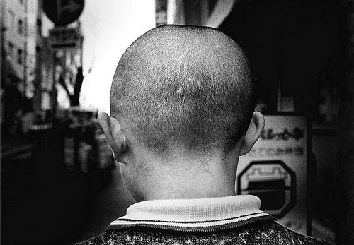
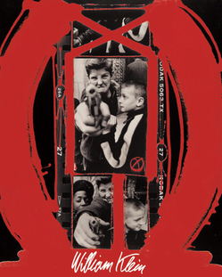
I visited William Klein and Daido Moriyama's photography exhibition at the Tate Modern. It explored modern, urban life in both Tokyo and New York from the 1950's onward. William Klein is an American photographer and film maker, born in 1928, through his photography he explored street life in New York. His photographs were often out of focus or blurred to show the busy, fast paced lifestyles in New York. He also used wide angles, high contrast and exposures which were said to have 'shocked the established order of the photography world'. William Klein focused on photojournalism and fashion photography. He also used some interesting post production techniques, such as adapting his contact sheets, to convey a more powerful image, this can be seen in the picture below. Daido Moriyama was born in Japan in 1938. He is mainly noted for his photography that depicted the breakdown of traditional values, post-war in Japan. He, similarly to William Klein, uses grain, blur and movement to capture the energy of the city; although he photographed in Tokyo. He moved to Tokyo in 1961 and started to photograph the city; his vision is dark, as he produces many edgy and shadowed photographs. In 1967 Daido Moriyama won the New Artist Award and from then on his work began to be published. I liked both photographers work, and may use some of their techniques in my portraiture project.
|
|
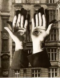
Herbert Bayer
|
I looked at Herbet Bayer's photograph, Lonley Metropolitan, which was taken in 1932. In this picture the photographer intended to challenge the visual imagery of the time, by creating a more surreal and abstract image. This can be seen from the eyes on the palms of the hand. He wants us to think about the abnormality of this, and what it might reflect. I think it portrays the idea that the man is reflecting on himself. Herbet Bayer is considering the change from typical photography, to a more surreal interpretation.
After looking at his work I created my own surreal images: 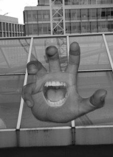
|
|
Digital Portraiture
Close up
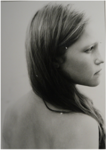
I experimented with different close up portraits, using different angles. For my final photograph I decided to take a side on picture, to make it more interesting. I like the picture as I think it captures natural emotion. To improve the photo I could take it in the studio to avoid shadows.
Extreme angle
I took a series of extreme angle portraits; firstly I explored with different levels, for example a very high angles. I then thought about how the positioning of different body parts can manipulate the perspective and angle. I think the high angle image of the girl works well as it helps to convey the emotion portrayed in the picture, typically the high angle would show vulnerability in the subject, but this manages to show confidence. If I were to improve the photo I would consider the composition to create more balance. To contrast this, I also like the low angle photograph of a boy in the tree. The extreme angle creates a sense of dominance and strength.
Studio Portrait
For my first studio portrait I just did a simple, mid shot; experimenting with different lighting techniques. I like the picture because I think the plain background highlights the subject, however I want to improve the image by trying something more interesting. I might experiment with various costumes to convey different personalities. The second two images are my further experimentation with the studio lighting. I decided to create an all white image, although this normally represents innocence, I think the photo is quite sinister.
Camouflage Portrait
In this series of photos I wanted to experiment with camouflage in nature. I achieved this by painting the subjects face, in order to blend in with the surroundings. I like the photographs, as they creates a sense of secrecy; I also like the contrast in the different shades of green. Although, I thought the contrast is too high, therefore for my two favorite photos I have lowered the saturation. I also experimented with different projections, in order to camouflage the subject. I layered two patterns and projected them onto the back drop and subject. I like the photo as it creates a subtle camouflage.
Symmetrical Portrait
In this series of photographs I attempted to create symmetry through reflection. I placed my subject against glass, in order to create a line of symmetry. I like the images as there is balance in the background as well as the subject. I think the photos could be improved if there was more focus in the reflected subject. Although I do like the fact that it creates a crisp image on one side and a more blurred on the other, as it shows a contrast in the symmetry. I want to explore other ideas of symmetry and may therefore experiment with symmetry that occurs naturally.
Masking Pattern
Through this series of digital photographs I explored different masking patterns using photoshop. I decided to use a World War 1 theme as when I was researching portraiture I found many interesting portraits of soldiers; I therefore attempted to recreate this. I created different masking patterns that related to my theme. I think it's effective, as portrays a wider story behind the image and provides context to the picture. I created the images on photoshop by layering them over each other and manipulating the opacity. I thought some patterns worked better in the shape of my subject, as it made it more personal. The other two overlay images create a foreground for the picture. To improve the photographs I thought I should make the overlay more dense, I therefore did this for my final one. The images are of soldiers pulling up an American flag, with another American flag layered over to emphasis it. I think it works well as it brings a strong sense of patriotism to the photo.
One Point Perspective
Before taking my one point perspective pictures I look at the photographer Franck Bauduin for inspiration, as much of his work is based on perspective. I particularly liked his picture that were taken in parks or the natural environment, such as his photo 'Palais Royal'. I took this into account when taking my series of photographs. I like the image of the path that is lined with trees, as it creates a sense of distance; however i think it would look better if the trees were more densely packed.
Balanced
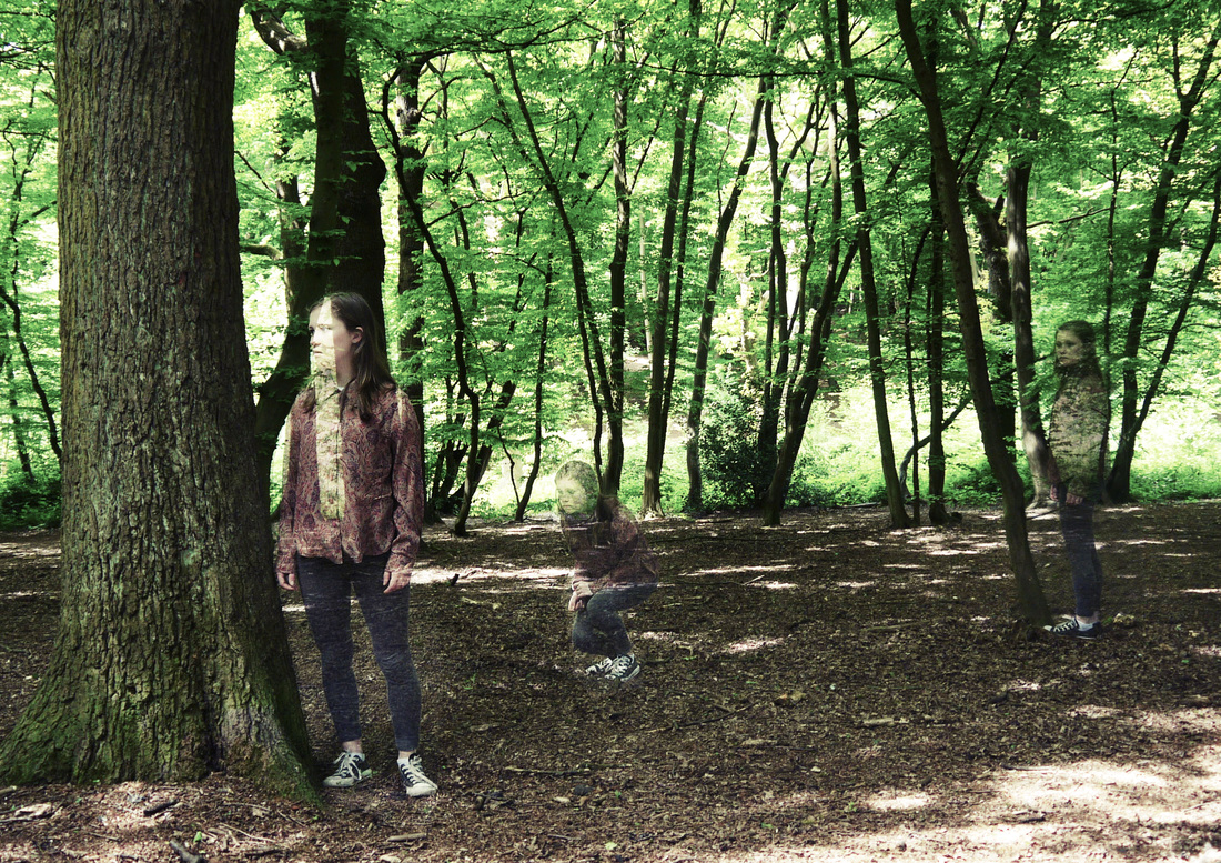
For these photographs I have tried to achieve a balanced image using two people. I thought about the composition of the photographs and experimented with the positioning of the two people, I thought the positioning in these two images worked best to create equity. I like the setting of the pictures, as balance is already created within the natural clearing.
Solarised
I solarised this picture in photoshop by making it black and white, then adjusting the colour curve. I like how it still creates different tones and textures, highlighting certain parts of the photo. I think the technique is most effective on skin, I want to therefore experiment with solarising photos that have more exposed skin.
Sepia
I decided to chose the theme of American Film; as I thought that it suited a sepia tone, allowing the sepia to compliment the picture. I used photoshop to create a sepia tone in the digital image. I also used it to create a vintage look for the photograph, I edited the texture, noise and glow for example; in order to suit the theme.
For my film photograph I wanted to create a grainy texture, to replicate the style of William Klein and Daido Moriyama. I printed the photograph in black and white and used a bleach and toner to create the sepia tone.
For my film photograph I wanted to create a grainy texture, to replicate the style of William Klein and Daido Moriyama. I printed the photograph in black and white and used a bleach and toner to create the sepia tone.
Film Portraiture
One Point Perspective For this photograph I wanted to improve on an idea that I had for one of my digital photos (based on 'Palais Royal'). I used a shallow depth of field in order to make the background more eerie. However, this is juxtaposed by the subjects expression; therefore to improve the photo I would change the subject to fit with the theme. Solarised Here I used the solarising technique in the dark room to create a crystallised effect. I think it worked well, although to improve it I would have the subject wear something different, as it doesn't seem to have a great impact on his clothing. 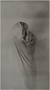
Extreme Angle I took this at a high angle and I like the fact that the subject appears to be hidden among the shrubbery. If I were to experiment more with extreme angles, I think I would explore with lower angles, in order to differ from my digital photograph. 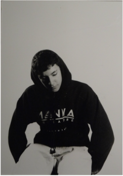
|
Close Up Similarly to my digital close up I decided to have the subject facing to one side, although this is more dramatic. I like the photograph, as I think it creates a sense of inscrutability. I worked in the dark room to burn in certain areas, although I think I could have done this to a greater extent. 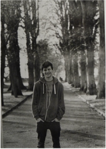
Masking Pattern Firstly I experimented with different materials, you can see the studio image that has bubble wrap layered over it. I like the texture it creates, however I thought it was too simplistic. I therefore tried out different methods using two separate film pictures. I tried layering the negatives on top of each other, but this didn't work. For my final photograph I exposed a studio portrait and then exposed a landscape over the top before developing it. I like it as I think it creates a sense of identity. 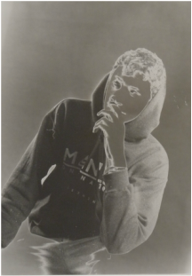
Camouflage For this photograph I used the studio and created a white camouflage. 
Studio Portrait When experimenting in the studio I took multiple photos to explore different emotion. I like the photograph as it is simplistic. Although I could explore different body postures. |
Denis Gifford
in Denis Giffords book, 'A pictorial history of horror movies' he explores the lost world of the golden age of horrorwood. It includes photography from various horror films though the ages. I was interested by the theme of fear and want to explore it through different means.
Faces at the Window
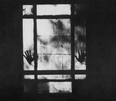
This photograph was from Curse Of The Dead 1966. The film is about an 18th century European village that is haunted by the ghost of a murderous little girl. I think the photo portrays the murderous nature of the girl, as the hands are the focus of the photo. This puts emphasis on the physical power of the child. The photographer has used balance and heavy black tones, this creates a sinister element. The use of windows is common in the horror genre, it creates a sense of false protection. The photograph is effective in portraying fear, as you can't see the girl fully. This creates a feeling of the unknown .
Dead Heads
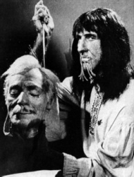
This photograph is from The Four Skulls Of Jonathan Drake 1959. Decapitation was popular in the horror genre around this time and the photograph conveys this. The photographer has taken a balancencd photograph with two subjects, although he has placed the head in the foreground to emphasise the focus of the photo. I like the emotion conveyed through the person on the right; as I think the direct eye contact makes him look fearful, which portrays his power.
Insanity Claws
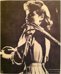
This photograph is from The War Of The Worlds. I think the subjects emotion successfully conveys fear and innocence. The shadowing used is effective as it makes it appear more edgy, as the darkness is a typical convention of fear. The claw creates a supernatural element which is relevant to the film. The photographer has used a specific angle to hide the creature, this makes the photo more interesting as it creates ambiguity.
Losing Face
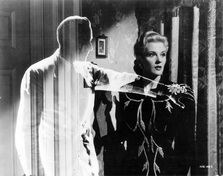
This photograph is from The Invisible Agent 1942. To convey a ghost like figure, the photographer has created a low opacity on the figure. This gives it a chilling effect as the figure is unclear which creates ambiguity. The photographer has also used a ray of light to illuminate the figure, which makes the photo more dramatic. The black and white tones also help reflect the time period of the 1940's.
Response
Strand 1


To produce this photograph I set my camera up on a tripod and took two pictures from the same position. I then edited them in photoshop which enabled me to produce the ghost like figure as I could alter the opacity of the figure. I wanted to use reflection as it can create a more complex picture, this compliments the horror genre. I edited the picture further, giving it a more dated appearance and creating black and white tones. I like the concept of the photograph but I think it could be improved by a change of surrounding. It would also look better if the ghost was closer, as this would make it clearer and enable you to see the background through the person.
Strand 2


Here I have developed my ghost theme and I have tried to create a sinister, ghostly photograph. I took two photos and over-layed them in photoshop, enabling me to change the opacity, this allowed me to created the ghost-like figure. I think the surrounding works well as it follows the original horror film genre. I first edited the picture in colour which worked well, but I then adapted it to a black and white version, to which I added noise to create a more dated photo. The ability to see through the ghost figure creates a more haunting effect and I think it works well. I also made the ghost look directly into the camera and the other person look away, this is effective as it makes the person seem unaware and therefore more vulnerable.
Strand 3


After looking at The Four Skulls of Jonathan Drake I experimented with decapitation. I used photoshop to edit the images, in order to create a horrifying image. I firstly took a simplistic but surreal photograph, using a detailed background and placing two heads in front to create balance, this worked well as it created a horrifying image. However I then wanted to develop this further and so I used various body parts to create a background. This makes the photo more horrifying as the as the different body parts have connotations of death and mutilation. I used photoshop to change the opacity of the body parts, this creates different textures and layers.
Alison Scarpulla
|
|
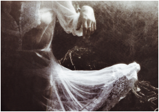
After looking at horror film photography, I wanted to take a more modern approach. Alison Scarpulla is a young photographer who experiments with film photography. She started photography as a hobby in high school in New York and now takes photographs that present an interpretation of herself and surroundings. She uses a double exposure in some of her photography, she has created photographs that combine reality and mystery. She has looked at contemporary and original themes of horror and has tried to create an eerie affect in her photography, and to do so she uses various techniques. In the photo on the right the double exposure creates a more haunting effect, as the low opacity portrays a ghost-like figure. By using a double exposure, the photographer is able to reflect the subjects emotion through the background. She said “The Victorian spiritualism movement and the photos that came out of it really inspire me, and I just can’t get enough of photographs from the 1800s to early 1900s.” This is evident in the picture on the right, as she has tried to create a traditional horror picture, using a Victorian style. She also experiments with physically manipulating her lens, for example by putting smudges on to it, in order to see what effect it creates.
Response
Strand 1


After looking at Alison Scarpulla I explored with layering photography. I took three photographs and merged them together using different opacities in photoshop. I was trying to create a chilling effect and therefore thought that a black and white image, with subtle tones worked best, as it creates a more eery atmosphere. I also adapted the opacity of the person in order to create a more distant effect. The background consists of two different photographs of brambles and dead shrubbery. They create texture, dynamic and sharp appearance make the photograph appear more scary.
Strand 2


I developed this idea further with a different people, I think the bare skin of he male adds to the chilling atmosphere thats created. I chose backgrounds that would reflect the horror genre and they therefore contribute to the photograph. I think the cobs webs and subtle brick works well, although the dark tone from the tree look better. It creates a more forceful background and has connotations of fear. The background in the bottom left photograph is effective as it makes the girl seem enclosed. To improve the photograph I think the peoples emotion could be adapted, as it does not compliment the theme as well as it could. I would therefore want the person to have a more serious or frightened facial expression.
Strand 3


Here I have developed my idea further, this time I tried to capture the emotion of fear, in order to complement the theme of the photographs. I used the same background through out with is composed of two layers, a carousel and cob webs, which has connotations of horror and therefore works well. I used three different people to see what works best. I think the top left photograph works well as it is close and central, allowing you to see the emotion. Although all of the expressions may be too false. I also experimented using colour curves in photoshop to create different effects.I think the top left one works well as the red colours could convey ideas of death and horror. I also like the top right colouring as it has a dark, bold contrast which makes it more intense.


I explored this theme further with different backgrounds, experimenting with different edits. I use the theme of burning for one background; I used photoshop to layer various photos of fire, I then layered a person over the top to create a horrifying effect. I like the colouring and texture that is created but overall I don't think the images work as well as previous ideas. I also created a chilling background using a foggy, deserted field and spider webs. I think it works well as the subtle colours create a cold and spooky atmosphere.
|
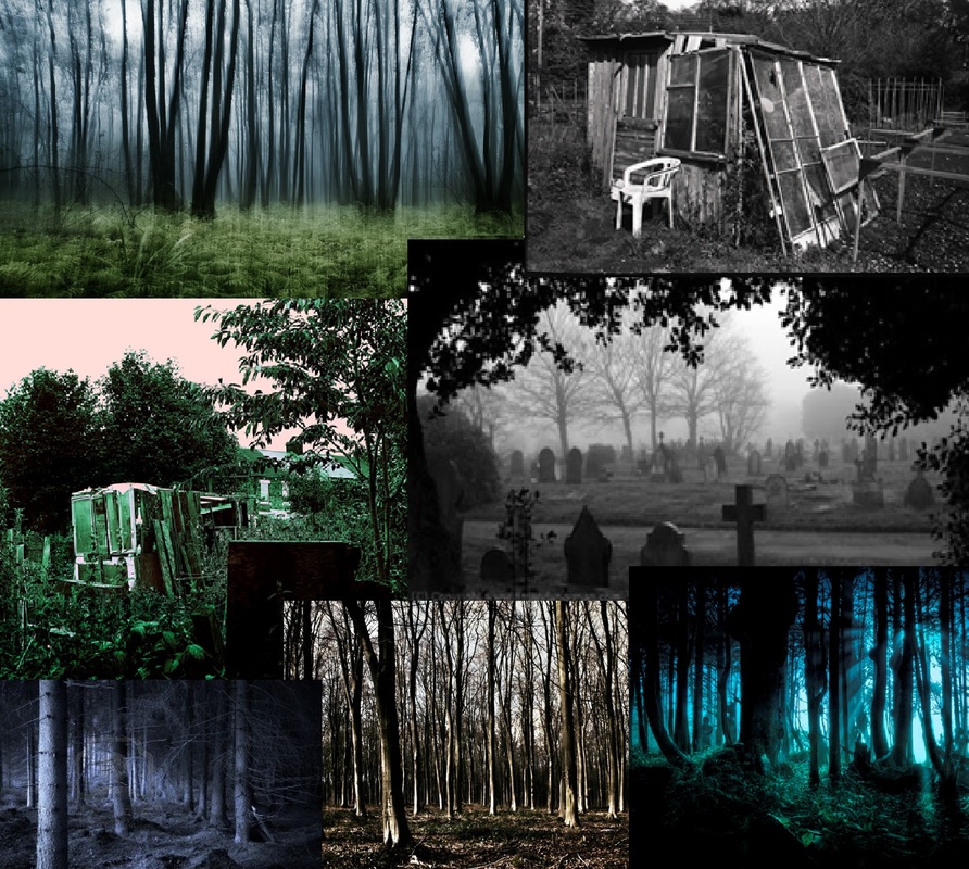
I now want to go back to my previous strand where I created ghost-like figures. I think it could work well, however I need to photograph in a better location to create the right atmosphere. To the left I have created a collage of photographs to give me some ideas. I want to go to a woods and graveyard, as I think they provide the right surrounding. I might also see if I can find an abandoned area, as that may also work well. Below I have tried to create different atmospheric backgrounds: |


|
I then visited the woods and graveyard, I took multiple photographs which are displayed in contact sheets to the right. These are my first edits below: |
|


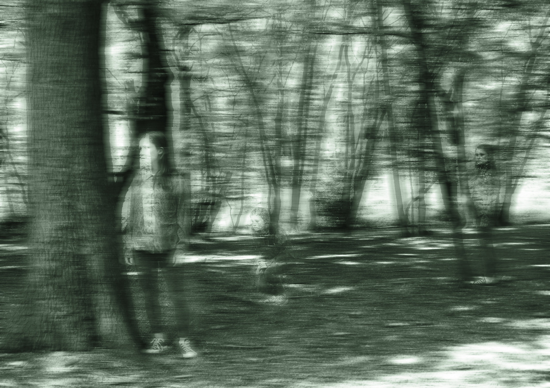
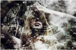
I think the images above did work well, however they could look more ghostly. I therefore lowered the saturation in some of the pictures to create a more haunting effect. I also distorted some of them by adding a diffused glow and for the bottom right image and I also played around with some blurring techniques.


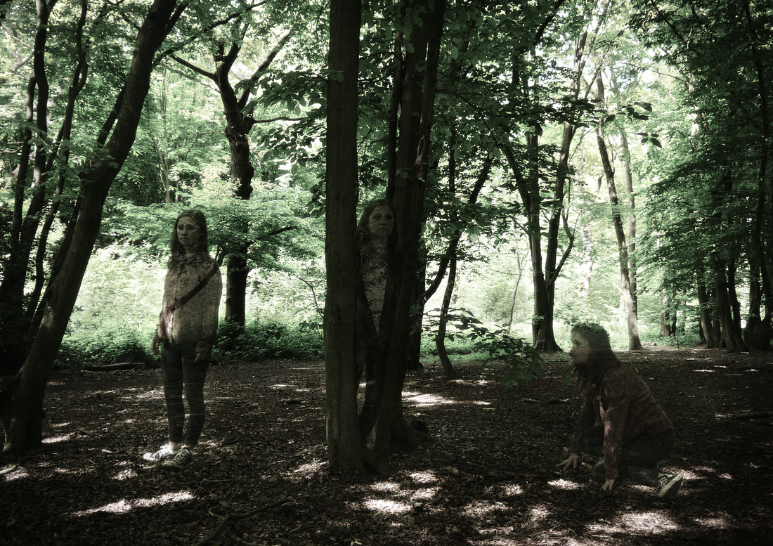
After this I then created an even more ghostly effect. This was achieved using motion blur and distorting the images in different ways. I then highlighted certain parts of the picture so they were in focus, such as the persons eyes and mouth.