Covert and Obscure
Gordon Magnin
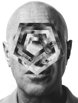
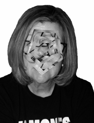
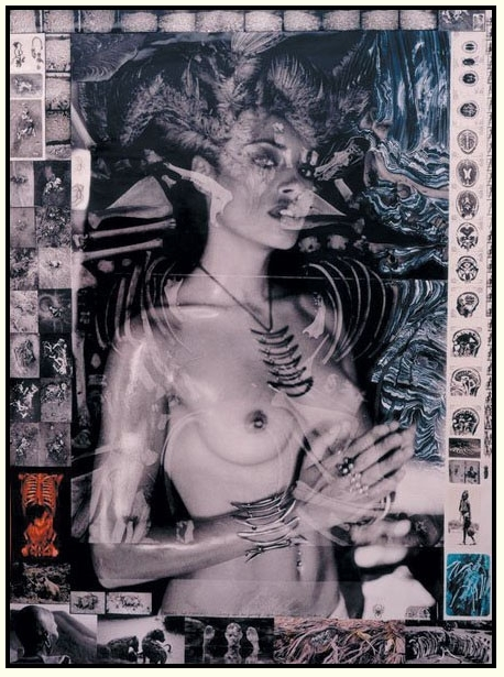
Gordon Magnin is looks at inventive ways to incorporate geometry, repetition and pattern into his photographs. He uses systematic operations as methods to distort images, and also challenges the intentions of consumer based images. He has edited this photograph to create several polygons consisting of different facial features. Gordon Magnin said that he doesn't like to know what the outcome of a photo will be, which creates uncertainty as the final outcome is concealed. This photograph creates a sense of abstraction as the face is distorted and it reveals more about the subject, which is what Magnin thrives to achieve. The photograph conceals the mans true identity as his actual face has been contorted. Despite this is reveals a new side to him as his features can been seen from a new angle and perspective.
Response
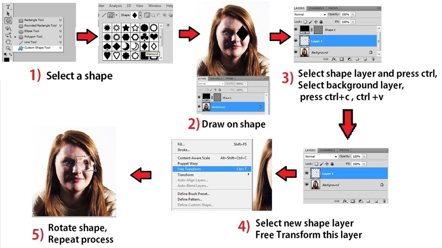
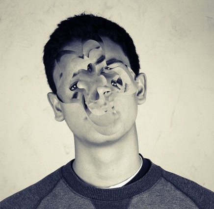
After looking at Gordon Margnin's work I used photoshop to create the obscured photographs below. I created shapes such as polygons and ovals and by copying the layers, created these repetitive shapes on top of faces. At first I just used a small part of the face, but then decided that it was more effective to do the whole face.
John Stezaker
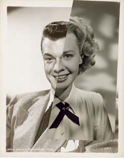
John Stezaker is an English conceptual artist who attended the Slade School of Art in London in the early 1970's. He finds images in books, magazines and postcards, often of classic film stars and then uses a collaging technique in order to merge two faces creating a hybrid of the two.
Physically Manipulated Portraits
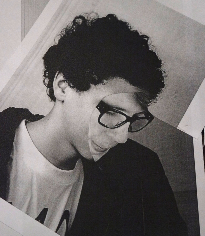
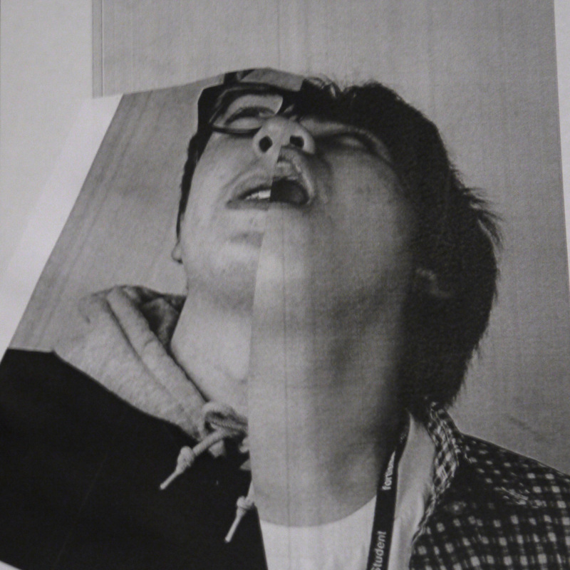
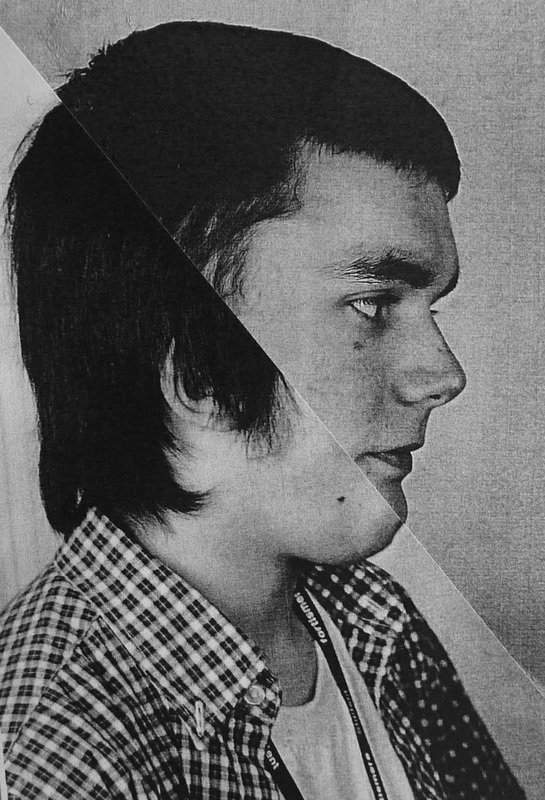
I looked at some of John Stezaker's photography work and decided to try and create some similar pictures myself. Using studio portraits that were taken in similar positions I created photo collages my merging two different faces. I did this by cutting a sticking parts of the faces together to create a new, obscured person.
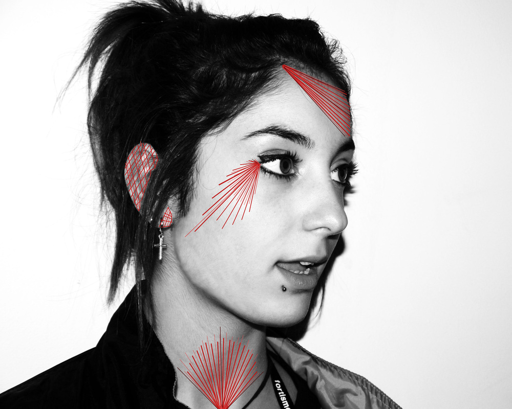
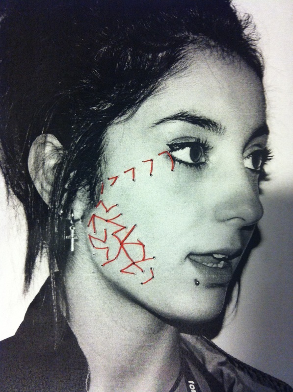
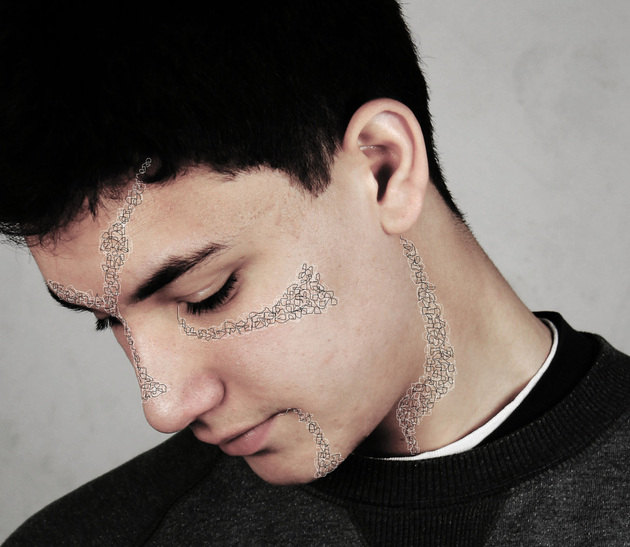
Maurizio Anzeri: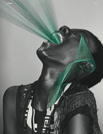
|
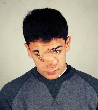
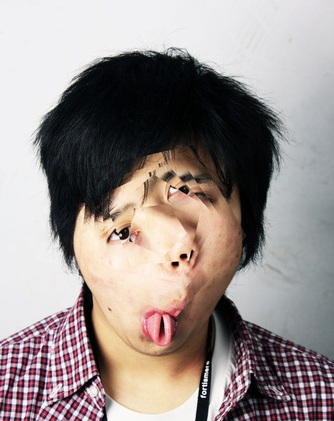
After looking at Maurizio Anzeri's work I experimented with Photoshop and drew onto images. I used lines of various lengths and thicknesses to create flares of red. However I thought that it looked too linear. I therefore used the drawing tool to create a more abstract image which worked better. I also tried to physically manipulate photographs, I did this by sewing into the image to create various patterns and shapes that obscured the image. |
Response
Stephen Longbottom
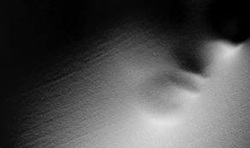
After looking at this photograph by Stephen Longbotton I attempted to create a set of portraits which also obscure detail but draw attention to shadows and texture.
Response
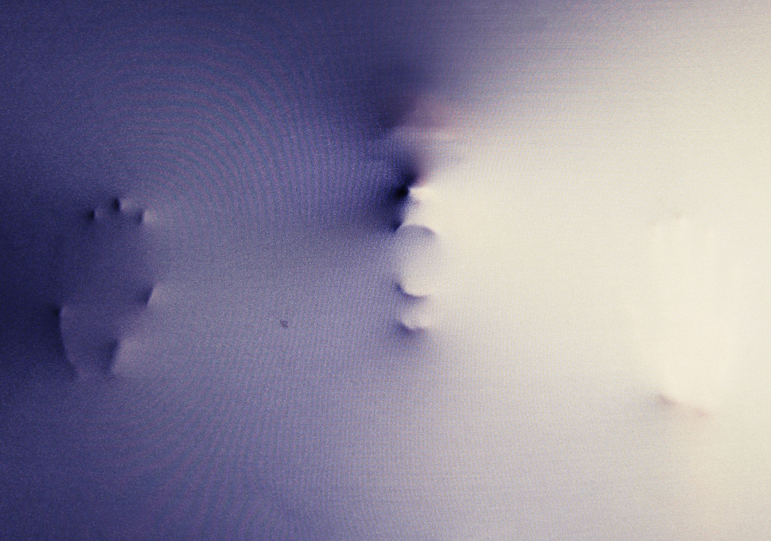
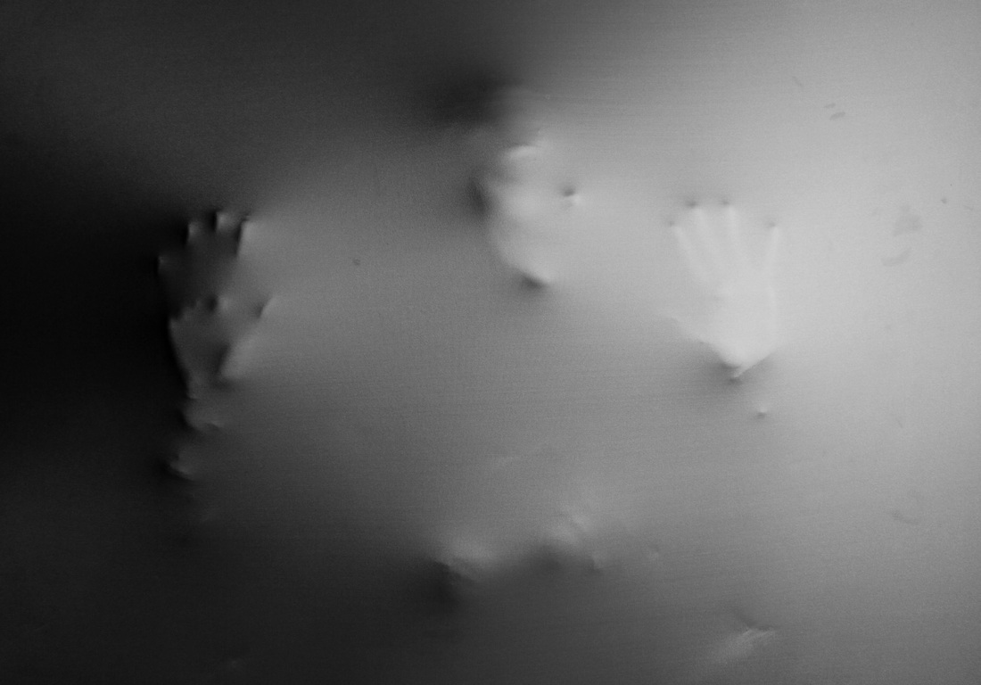
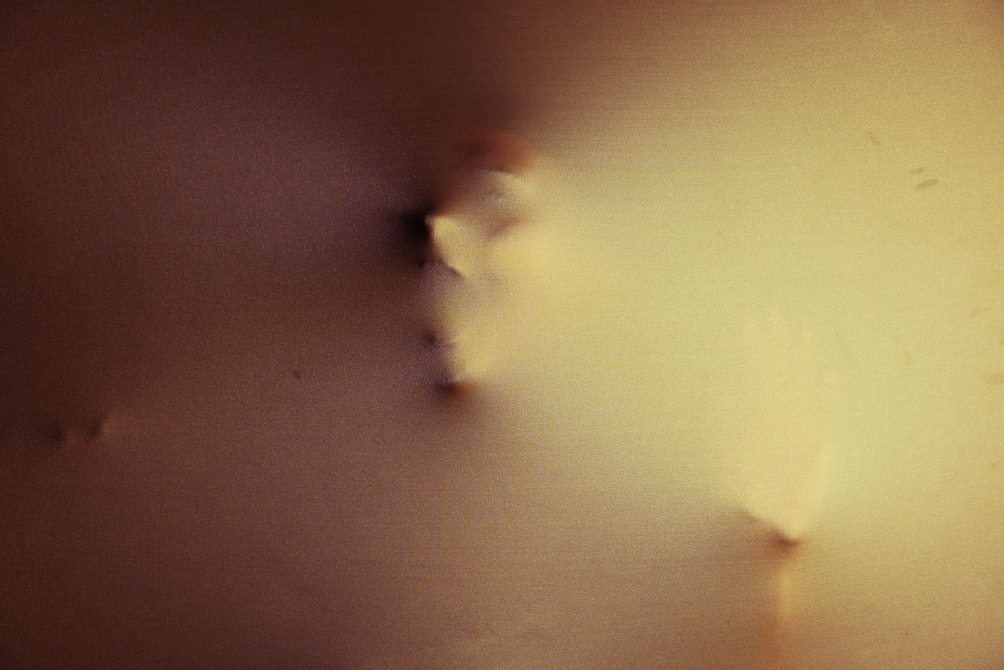
Here I experimented using a screen in the studio. I tried to create a strong sense of texture by only revealing a few, sharp body parts. I think this creates a harsh image, making it seem quite sinister. I also experimented with editing the colour tones, as specific colours have certain connotations and can therefore help present your idea behind the image. For example the red tones have connotations of death and therefore help the subject to appear trapped.
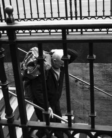
Sophie Calle
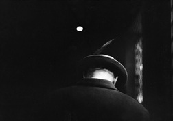
Sophie Calle is a french photographer and this is a photo from her collection called 'Suite Venitienne'. She decided to stalk people in Paris "for the pleasure of following them", this is of a man that she briefly met in Paris, and followed him to Venice where she photographed him for several days. In all of her photographs of Henri.B, his face is always hidden and this photograph is no exception, it creates a sense of mystery as his identity is unknown. This photograph consists mainly of darkness and shadows, this helps portray the sinister, stalking effect that she was after. The one bright circle acts as a spotlight, as to illuminate and highlight the man which helps present him as a target. Sophie Calle has taken the photograph from behind at a level angle. This shows that she is following him, and conveys him as a vulnerable subject as he appears unaware of her. His head is bowed which also helps to reiterate this idea.
Response: Stalking Task
After looking at Sophie Calle's stalking collection I went out and took my own series of photographs. I stalked the same person and ensured that their face could never be seen, as I think this element of Sophie Calles work was effective, as it makes the photographs more intriguing, I attempted to capture my subject from different angles to show different aspects of them. I think the photographs taken from behind the subject work best as it shows that they're being followed. I also think the photos taken from behind something are effective because it conveys the idea that I am hidden. I also wanted to capture their mundane, natural actions and I think my set of photographs manage to convey this. I chose to edit my photographs in black and white as it creates a sense of mystery and suspense. To improve the photographs I think I could have taken a larger set, in order to present my subject in more environments. I could also look more at the composition of the photos.
Continued Stalking
|
|
Obscured View
|
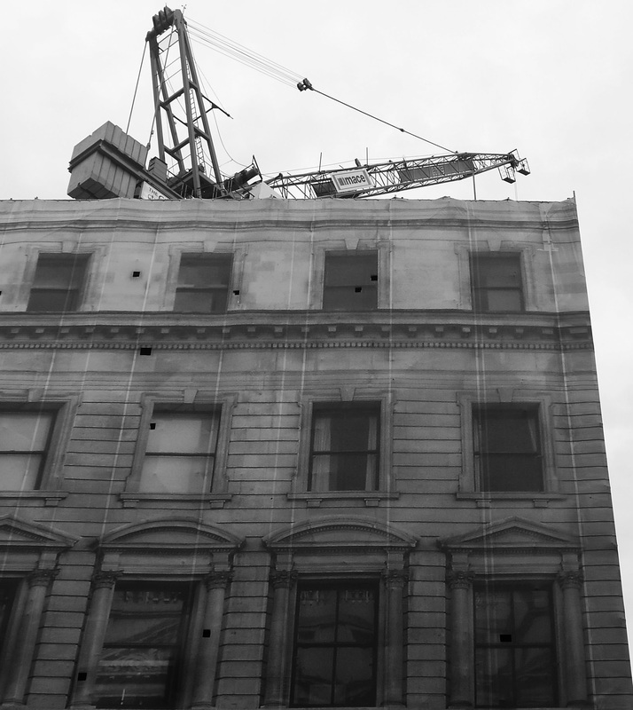
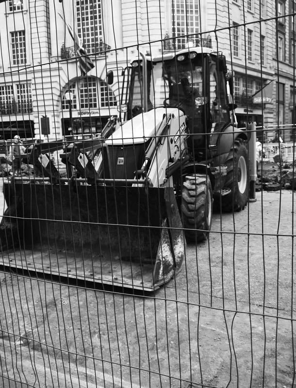
When we went on our trip to the photographers gallery we also walked around central London. I looked at how one thing can obscure another:
|
The Photographers Gallery - Perspectives on Collage
I visited the Perspectives on Collage exhibition at The Photographers Gallery in London, which consisted of various artists that presented unique ways of collaging photographs and explore the limits of a photograph. The gallery consisted of 3 floors that presented 10 artists work, all of which explored collage techniques. They all related to our exam theme of 'covert and obscure' as they were complex and presented hidden images. The visit was therefore helpful as it showed me how you can use collage and layering techniques to respond to the exam title.
One artist that I thought created some interesting work was Roy Arden:
One artist that I thought created some interesting work was Roy Arden:
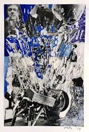
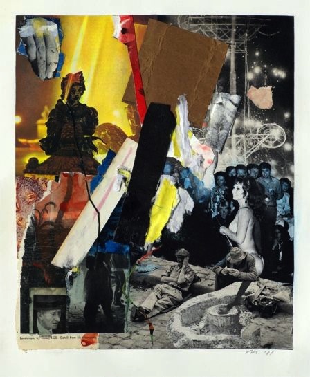
Roy Arden was born in 1957 in Canada and through his career has worked across media. He first started creating collages and art in the 70s as a teenager as he was influenced by art movements such as pop art. He creates tactile collages that explore both psychology and politics. He starts by gathering material from a wide range of sources and then selects the pieces that he finds most intriguing and revealing. He then creates collages that are intellectually challenging as well as pleasing to the eye. By layering images and materials he creates various textures in his collages which makes them more interesting and diverse. In the collage on the left you can see that he has used a scratching technique which creates texture but also creates an explosive image, this was my favorite of his 9 works that we saw. Roy Arden said "I think it has been about freedom - which more and more is also becoming the subject of my work", I think this idea of freedom is present in this collage. I think most of his work relates to the theme of covert/obscure because there are often deeper or hidden messages and ideals in his work.
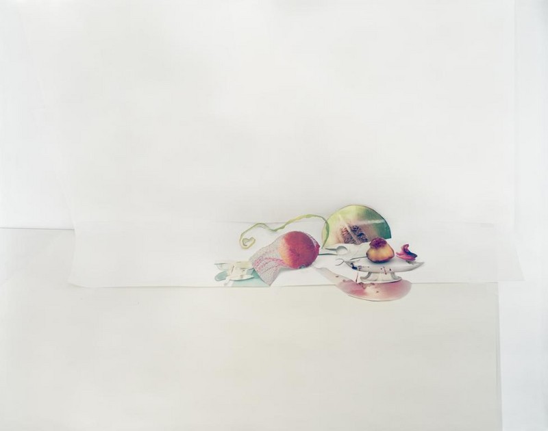
Laura Letinsky
Laura Letinsky is a Canadian artist and also works as a professor at the University of Chicago. Her work appeared in The Photographers Gallery in London which I visited. In her work she uses one or a few real objects and then places cut out images around it. The images appear to be real objects, creating a surreal collage effect. After looking at her work I created a collage to mimic her piece on fruit.
Anna Parkina
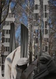
Anna Parkina was born in 1979 in Russia, she has worked in sculpture, painting, performance and photography. She arranges her own photographs into densely layered compositions. I like the image on the left as she has merged the trees with a tower block. therefore interconnecting the natural and urban world. However she has managed to do this subtly and so they merge together.
Wildlife
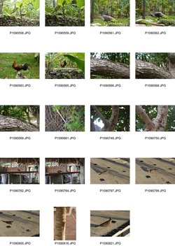
When initially exploring the theme of covert and obscure I looked at wildlife photography. In order to capture the animals I used a fast shutter speed of around 1/320 because they were often moving, and so this enabled me to get a sharper focus. I also had to zoom in, as getting close to the wildlife can be difficult. However I was only using a 14-42 lens which made it difficult, this is apparent in the last photograph of the bird. Therefore, if I were to develop this further I would try and use a different lens in order to get closer pictures. I think the photographs of the lizards work best, as I have used a wide aperture to create a shallow depth of field, which allows us to focus on the wildlife.
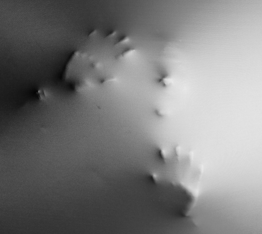
Shadows
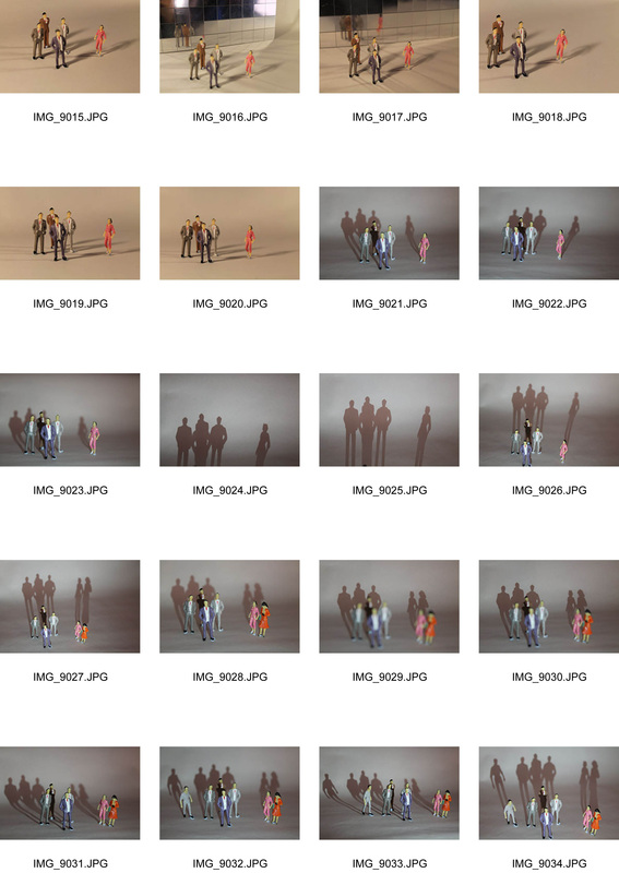
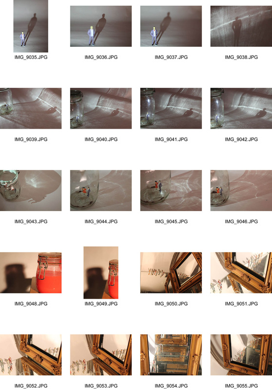
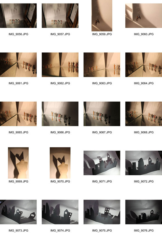
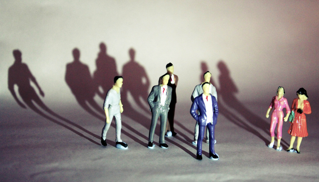
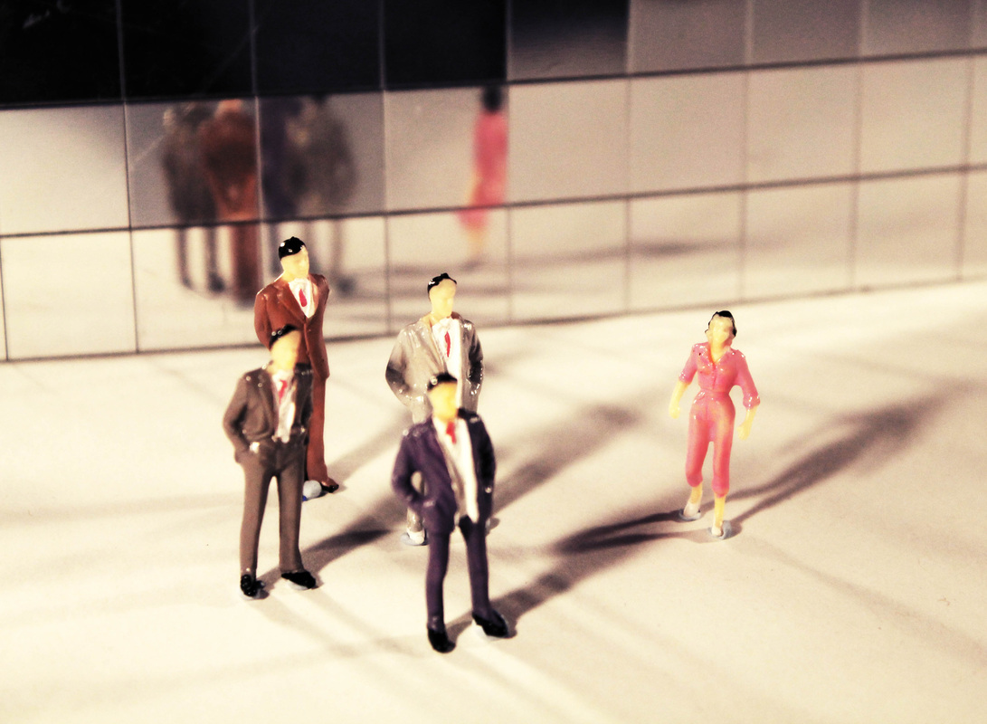
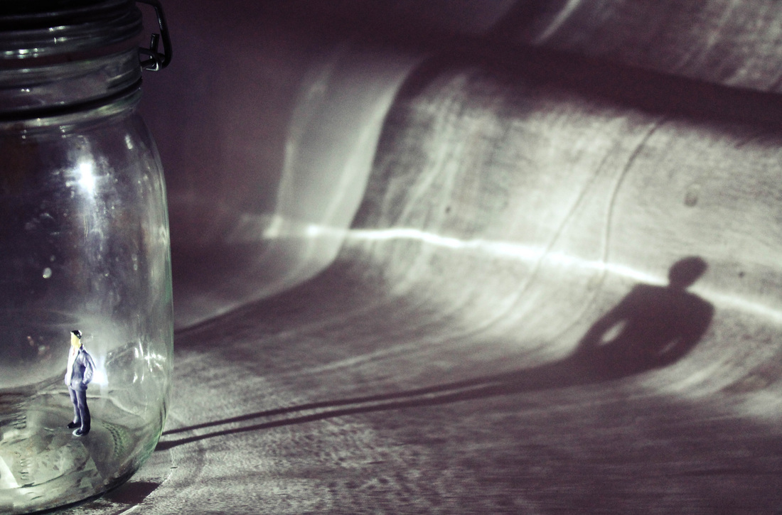
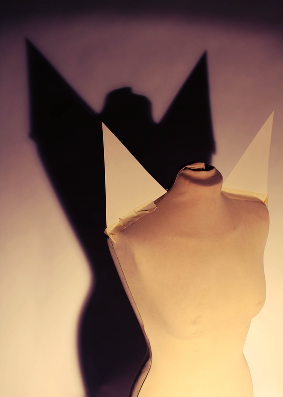
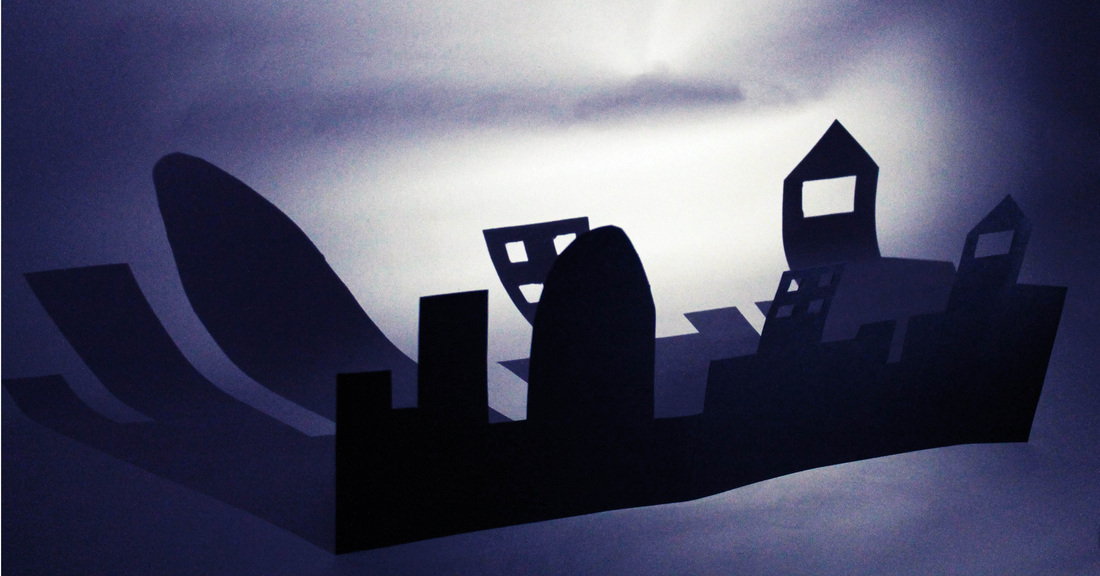
When trying to create interesting shadows I used the studio and adapted the lighting in order to project different shadows onto the background. I started by using small figures and then to create a more interesting image I experimented with reflection as well, although this reduced the intensity of the shadows. I then used the jar and a figure to create a shadow, which I think works best as it creates a sense of texture as well as reflecting different tones. The composition of the photograph also works well and so I think this was the most successful one as it has created an interesting shadow. I also used objects to create shadows, for example the mannequin above, I liked this but thought that I could create a more interesting shadow. I therefore made the city silhouette out of card in order to create a more diverse shadow. If I develop this idea further I might experiment with different angles and lights to create different length shadows.
Strand 1 - Hidden Locations
I decided to try and capture covert landscapes, trying to find undiscovered or hidden locations. If I decide to develop this idea further, I might look at creating panoramas.
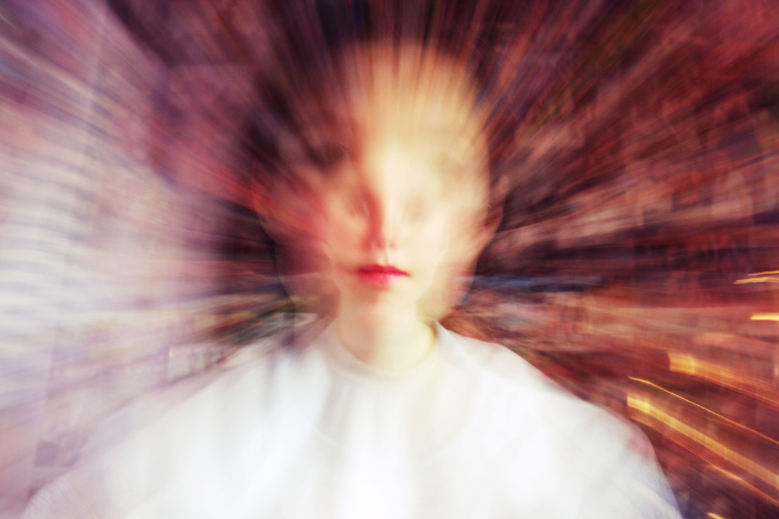
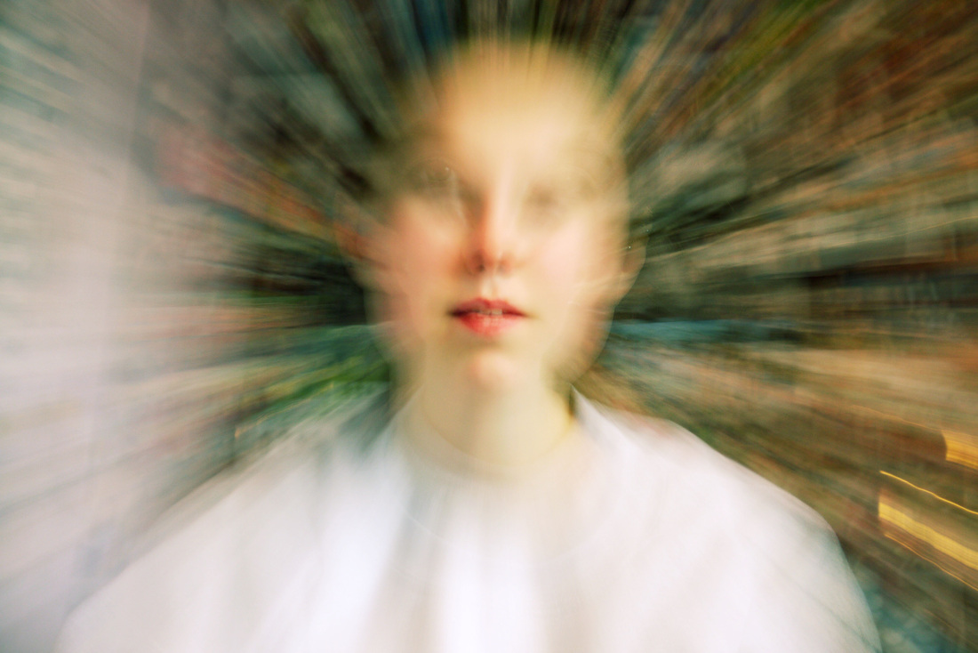
Strand 2 - Distortion
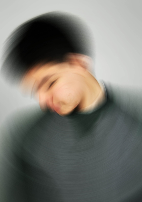
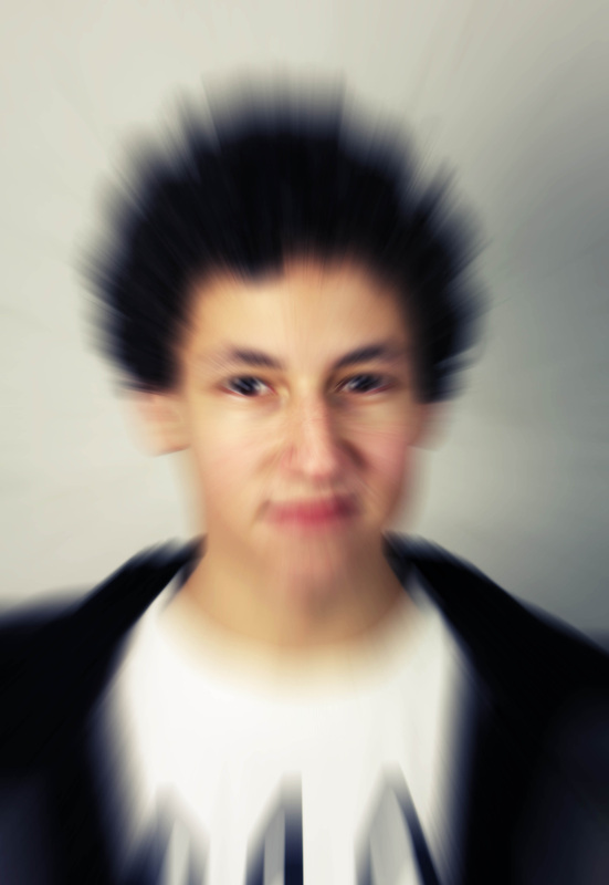
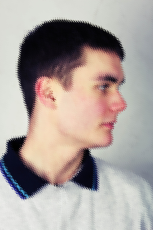
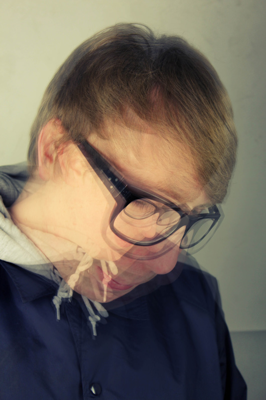
Here I have used photoshop to distort various portraiture photographs. I experimented with different types of blur and also used other distortion techniques such as waves and pinch. For the bottom right image I used the pinch layer and created five layers with different levels of distortion. I like the layering effect but I don't think it was too successful as it's difficult to individually see the layers. I think the zoom blur works best as it creates a sense of movement. Although it would be more effective on a different type of picture, for example one with motion.
|
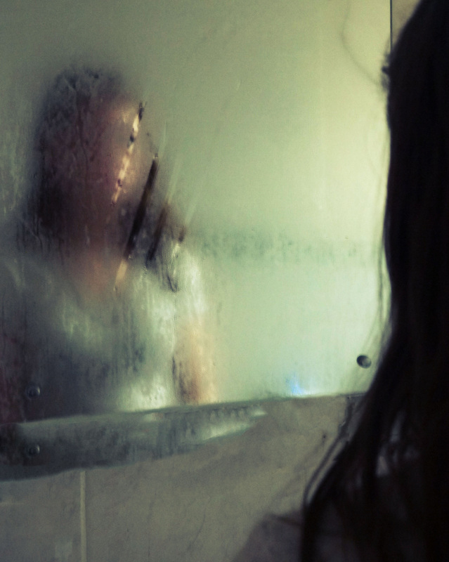
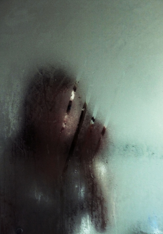
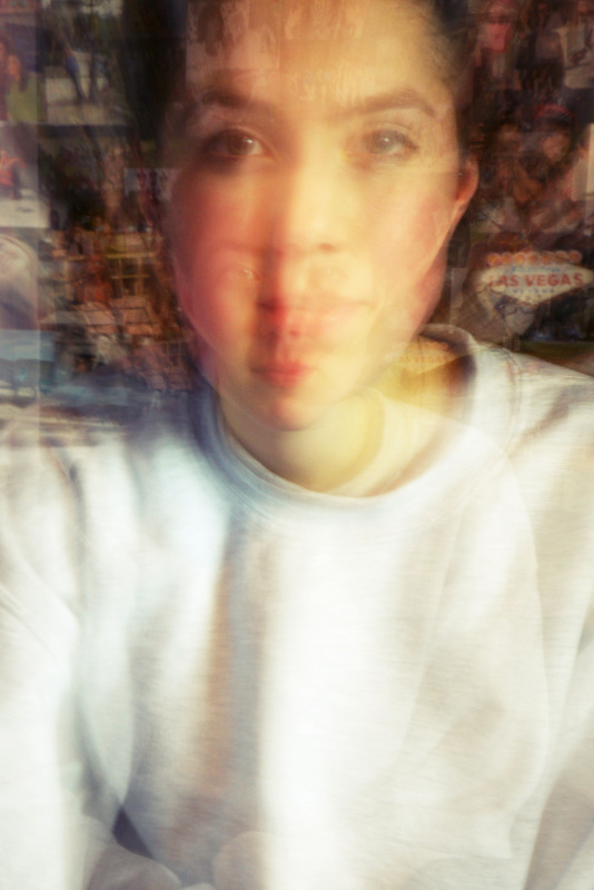
After digitally manipulating photographs I then used a mirror with condensation on it to distort the image and obscure the person in the reflection. I think the image on the left works well as the persons face is obscured by the condensation but you are also able to see that it is a reflection as the back of the person is visible. Where as in the photograph on the right you are unable to tell that it is a reflection. If I were to develop this further I would photograph in a brighter room as there was quite dim lighting, but I was unable to use the flash as it reflected on the mirror.
|
I liked the zoom blur effect that I previously used when distorting faces and so I have created some zoom blur images manually. I did this by putting my camera on a slow shutter speed of "1 or "2 and then zooming in or out while taking the photo. The background of the was very complex and colourful which worked well when creating a zoom blur as it left trails of colour. However only part of the face remained in focus and I think it would look better if more of the face was visible. Therefore to improve it I could either use a tripod or lessen the zoom. |
Peter Beard
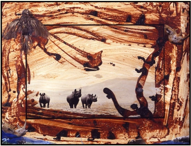
Peter Beard was born in 1938 in New York City and as a child kept diaries, which is how he first started taking pictures at the age of 12. He was heavily inspired by his trips to Africa, his first trip was to Kenya in 1955. In the early 60's he worked in Kenya's national park, which is where he started to capture wildlife images (top left), he documented the demise of 5000 black rhinos. He then physically manipulated the photographs to show how endangered the species are. In the right hand image he has used a more systematic method of collaging by creating a border of photographs. He has selected photos that relate to the over riding theme and they therefore compliment the central picture.
Adam Justice-Mills
I saw some of Adam Justice-Mills' work and liked his interpretation of collaging. He named his work 'visual poems', as he uses the idea of abstraction, in which he considers the wider idea rather than just the specific image. I don't know how he has created his collages but I assume that he has used photoshop to layer the various images. I might therefore experiment with photoshop in order to achieve a similar effect.
Strand 3- Response
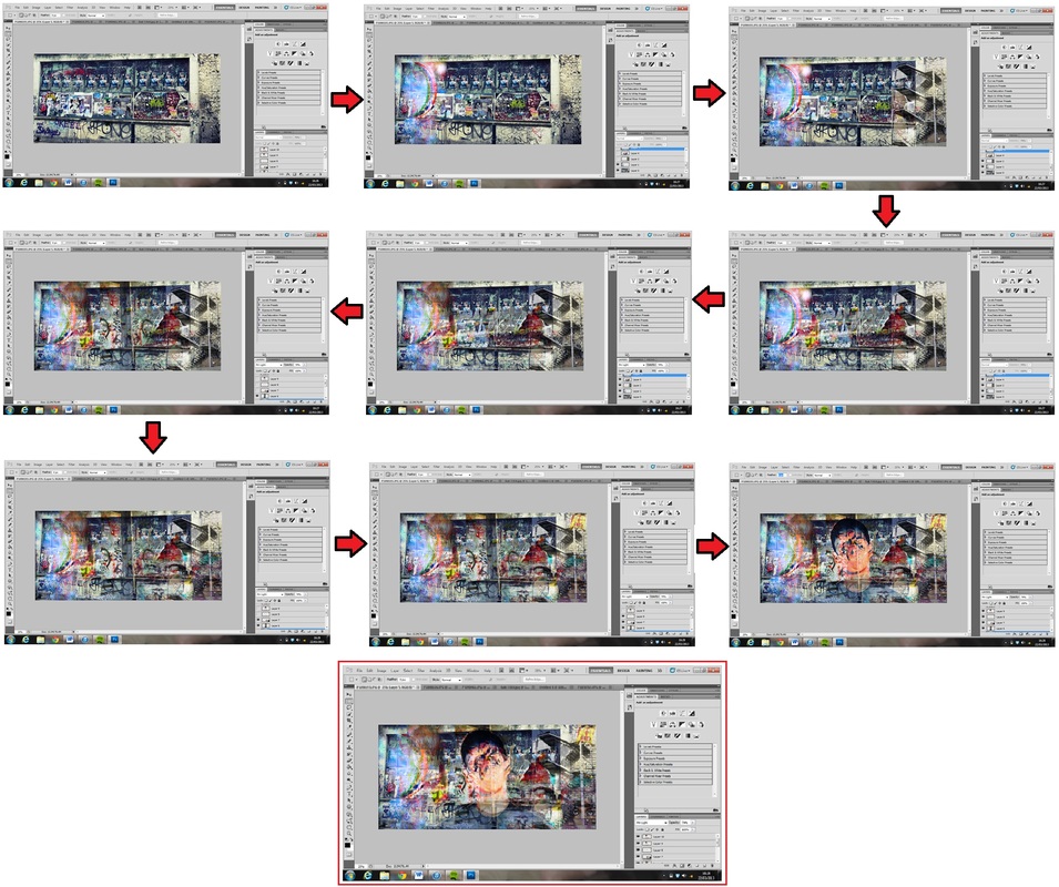
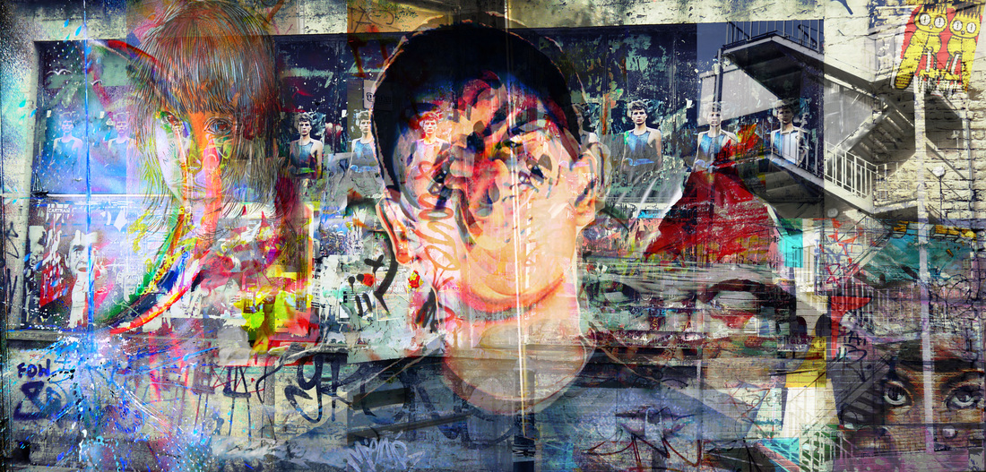
After looking at Adam Justice-Mills' work I used photoshop to create the image above. I experimented with different layers to create this street/graffiti themed photo. I took a bulk of photos of London graffiti and layered them using different layered edits. I wanted to create a complex image where more can be seen as you look closer. I also placed a person in the center of the image in order to create a focus. I want to experiment further with creating these collages, as much of it is trial and error to see what works and what images compliment each other.
|
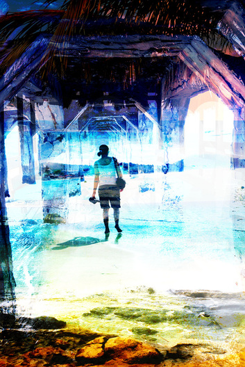
For this photo I created a more tropical theme by layering various photographs. I think the positioning of the person works well as they are centered through a narrowing pier that creates a distancing effect, this therefore makes it seem as though the person is walking into this distance. Therefore I think the composition works quite well. However the middle section of the image is too empty and therefore the photo as a whole does not work well. Although I do like the colour tone changes throughout the picture. |
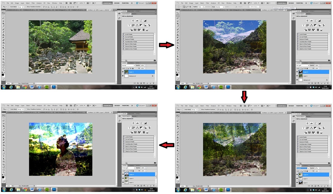
To create the image below I first took a landscape picture. I then layered three more landscapes on top of this and edited the opacity of some layers. I also made one layer 'pin light' and another 'overlay'. I then layered on the photo of the person and made that 'vivid light'. I then went back and used the eraser tool to ensure that all the layers merged together neatly. Lastly I edited the brightness and contrast.
I then made this image (right) which corrects the fault of the previous two (empty space). Although I think it may be slightly too detailed throughout the picture, which prevents you from seeing some of the landscapes. |
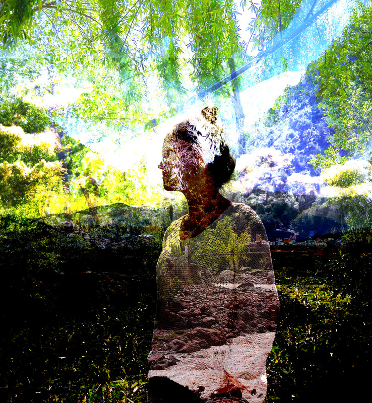
This is another digital collage that I created, I have used a natural theme throughout with different layers of landscape. I have created neutral tones to present the natural surroundings. I think the persons profile works well as it allows them to blend in with the surroundings rather than being a separate layer. I also like the fact that you can see through the person as it creates a more dimensional image. However I think the top part of the image is too bright and there are too many negative spaces. 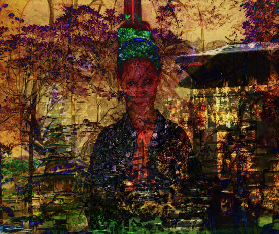
|
Here I have explored further by creating two landscape photo collages (above and right)
|
|
Dan Mountford
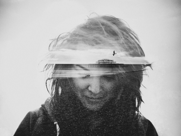
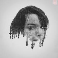
Response
After looking at Dan Mountford's work I created the two images below by merging a landmark/building with a persons face:
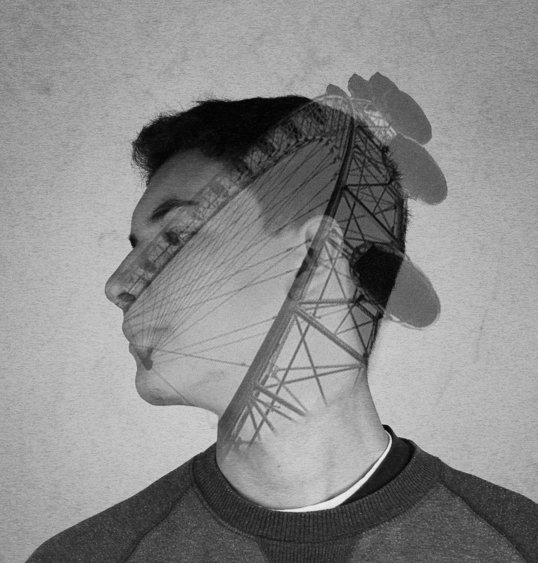
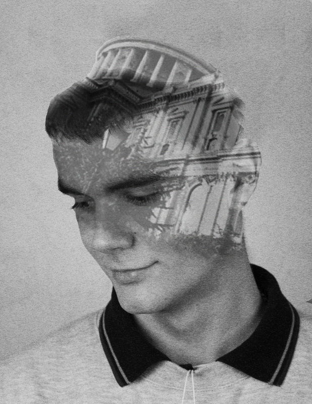
I tried to use images that would fit the shape of the persons face and head so that they would combine well. I altered the opacity so that the landmark would merge with the face and I think this worked well in the right hand image. Creating these images was useful to see how I can merge landscapes with portraits. However if I develop this further I will think about altering the contrast and finding landscapes that fit well with the persons face shape.
I then refined the collage, using less images to try and improve it (image to the left). I tried to make it less dense, which was slightly successful, although it's made it too overexposed. I think the images could work better together as they don't blend very well.
|
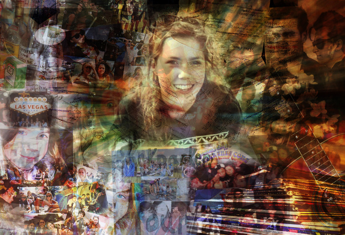
I decided to chose a specific person for the theme of my image and I therefore took photographs of personal items, places and moments. I then edited these together to produce the image on the right. I don't think it works that well, firstly because it is too busy, which detracts attention from the main images. In my previous collages I used a central person and so I did this again here but in this case I think it stands out too much and therefore doesn't blend in with the collage. However I do think the rays of light emitted from the central person work well as they create a focus.
|
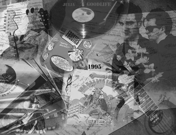
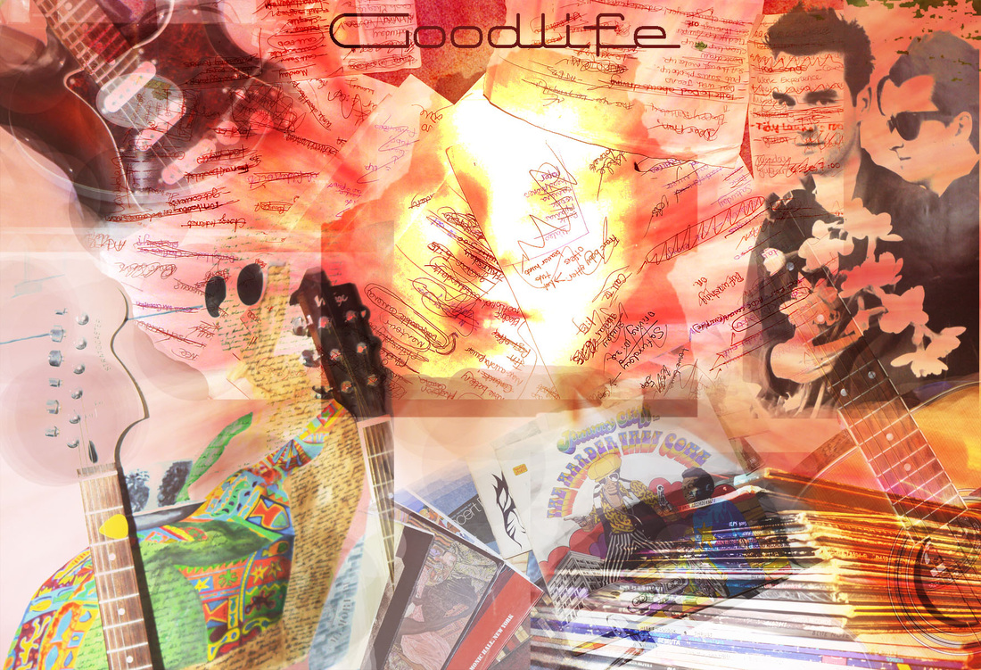
After taking those points into consideration I created this image (above). I think it works much better as it is not too compact but is still visually interesting. I made it black and white so that the tones of various images didn't effect how well they fit together. I think the layered writing works particularly well as it creates a separate layer, giving the collage two dimensions. To develop this further I could chose a different person to base the collage around and therefore experiment with different images.
Here I have created another photo collage, although in this one I started with one central character and then decided that it looked more interesting to have three but all with slightly different body language, as it improves the composition of the photo. There are still sections that are more burnt out than others, but I think this time it works as it creates different tones and contrasts. I think this collage works particularly well as the layering has created different passages which makes the image more interesting.
|
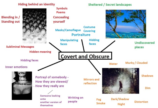
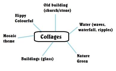
I wanted to develop this idea further and so I made this mind map to try and think of some ideas for a theme to base it on. |
|
|
I want to create a final piece that has both a layered background and a central figure(s), for this to work I don't think the background can be too complex. To the left I have made one using the theme of glass buildings and so I layered various buildings and glass textured. I then reflected the central figure as I thought it suited the theme of glass and reflection. However I don't think the image works well as the geometric background doesn't compliment the central figure.
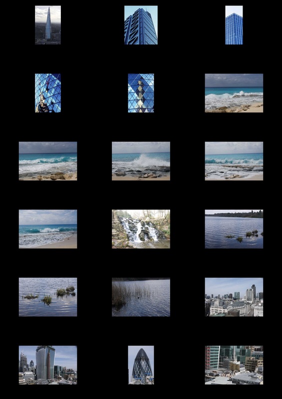
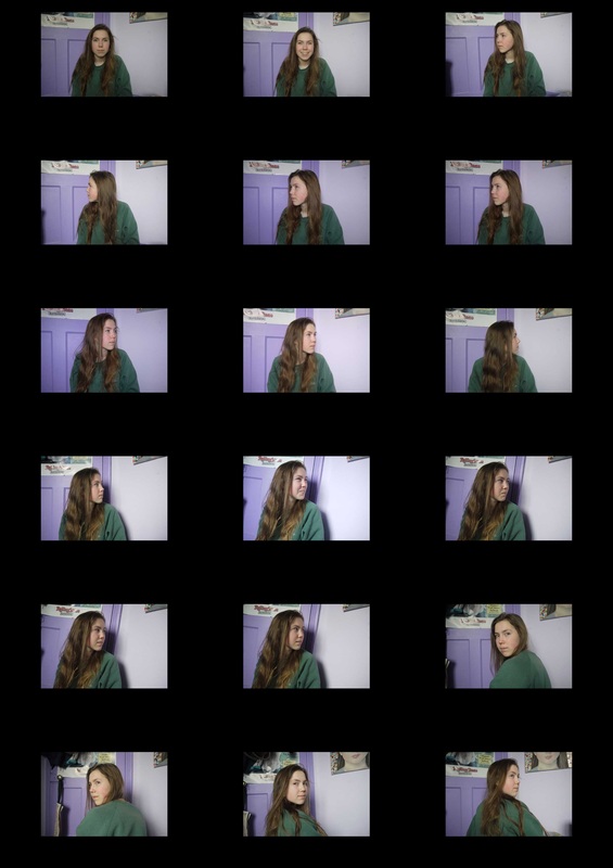
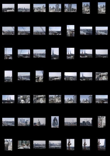
Contact Sheets:
|
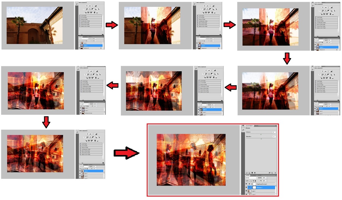
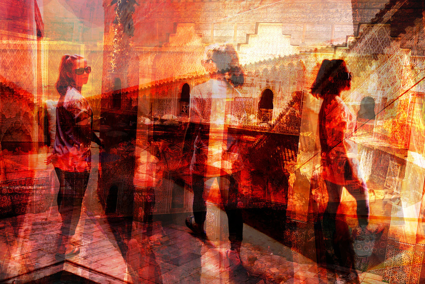
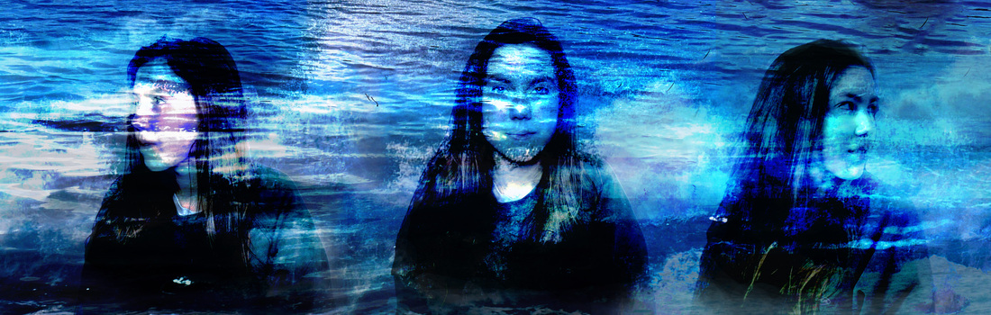
I then created the image below using images of water and waves. I layered 15 photographs and altered their contrast and vibrance to create the background. I then chose to have three central figures, which I think work well as they are all similar but have been taken from different angles. I think the most successful part of the image is where the faces meet the background. This is because the movement and layers of the water are reflected onto the persons face. This works particularly well on the central figure, as you can see it has also given her crystal blue eyes. I think the composition of the photograph is good, however the image is not complex enough.
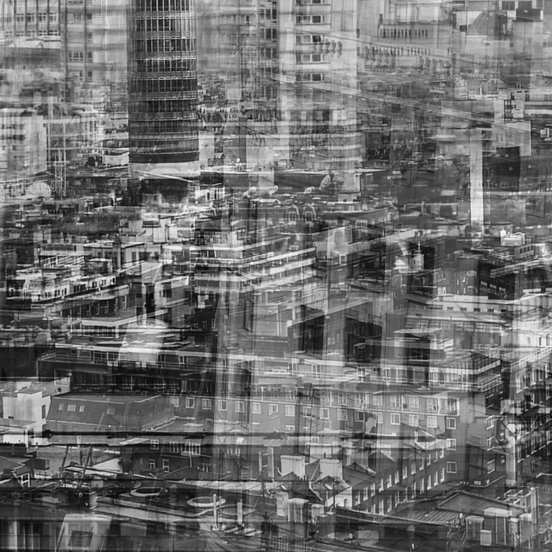
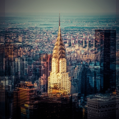
Laurent Dequick
Laurent Dequick is a french photograph although he is an architect by profession. His interest in architecture is present in some of his work as he often captures vast buildings and city landscapes. In his work he attempts to recreate the congestion and frenzy of densely populated urban areas. Through layering his images he manages to capture the proliferation of developed urban areas and presents their energy and life. Laurent mainly photographs cities such as New York, Paris and Berlin. He said “Along the streets, the lights, the noise, the traffic, the swarms of pedestrians, the blend of smells, are so fascinating that no single shot can entirely capture it." He therefore takes multiple photographs and overlaps them in order to create more complex street life or architecture. In his work he tries to present an idea rather than just an event or action. Laurent condenses his images and manages to present the movement, colour and everyday life of urban places.
|
I looked at Laurent Dequick to develop my idea further. This is my initial development (photo on right). I think it works well as the layered images portray the energy and busyness of the area. I like the idea of layering city landscapes and I am therefore going to develop it further, I will probably go to central London to take more pictures. |
|
|
|
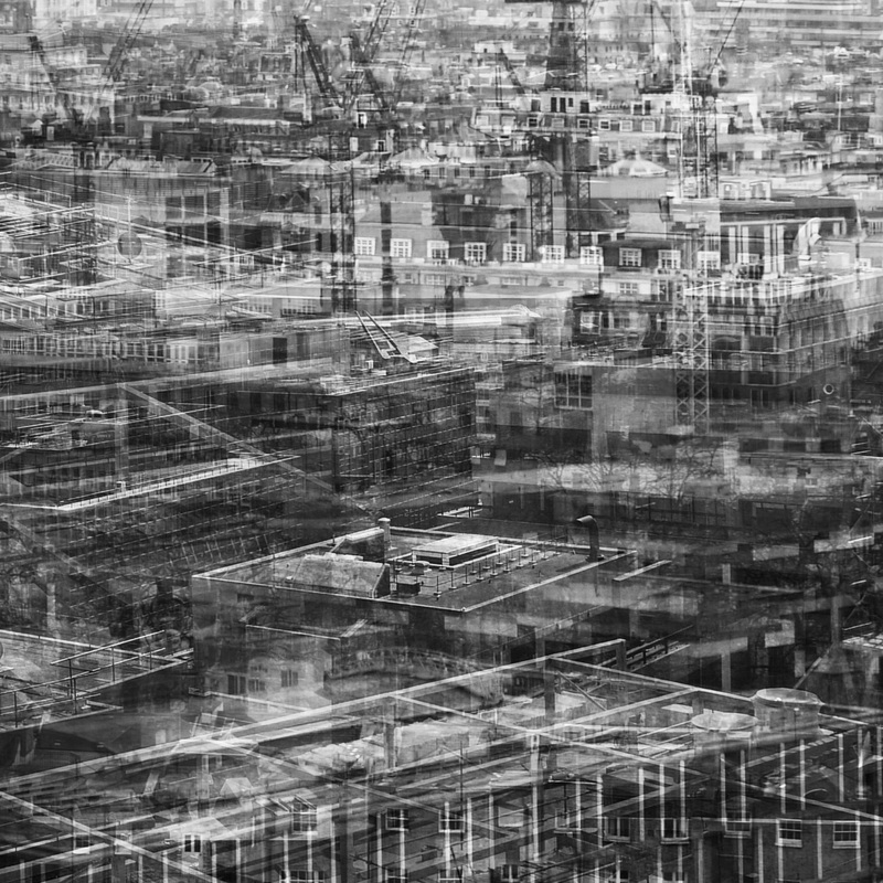
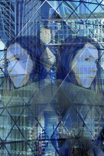
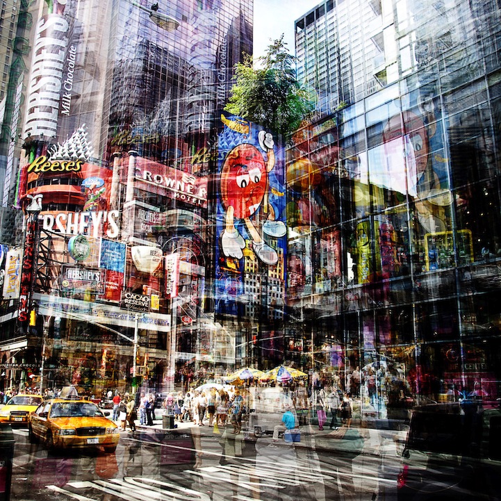
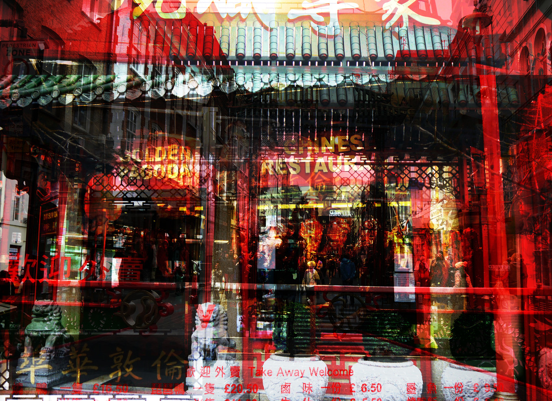
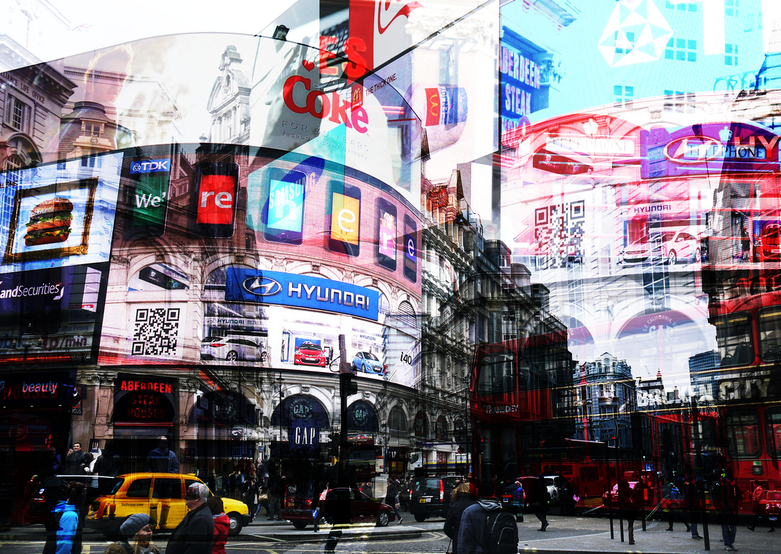
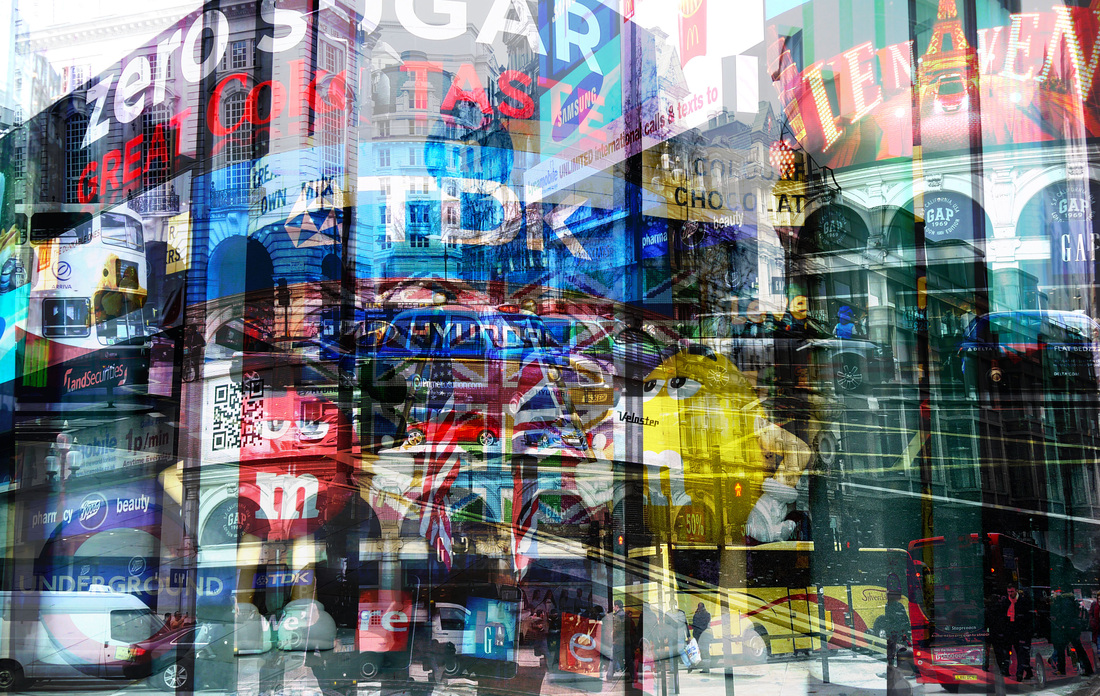
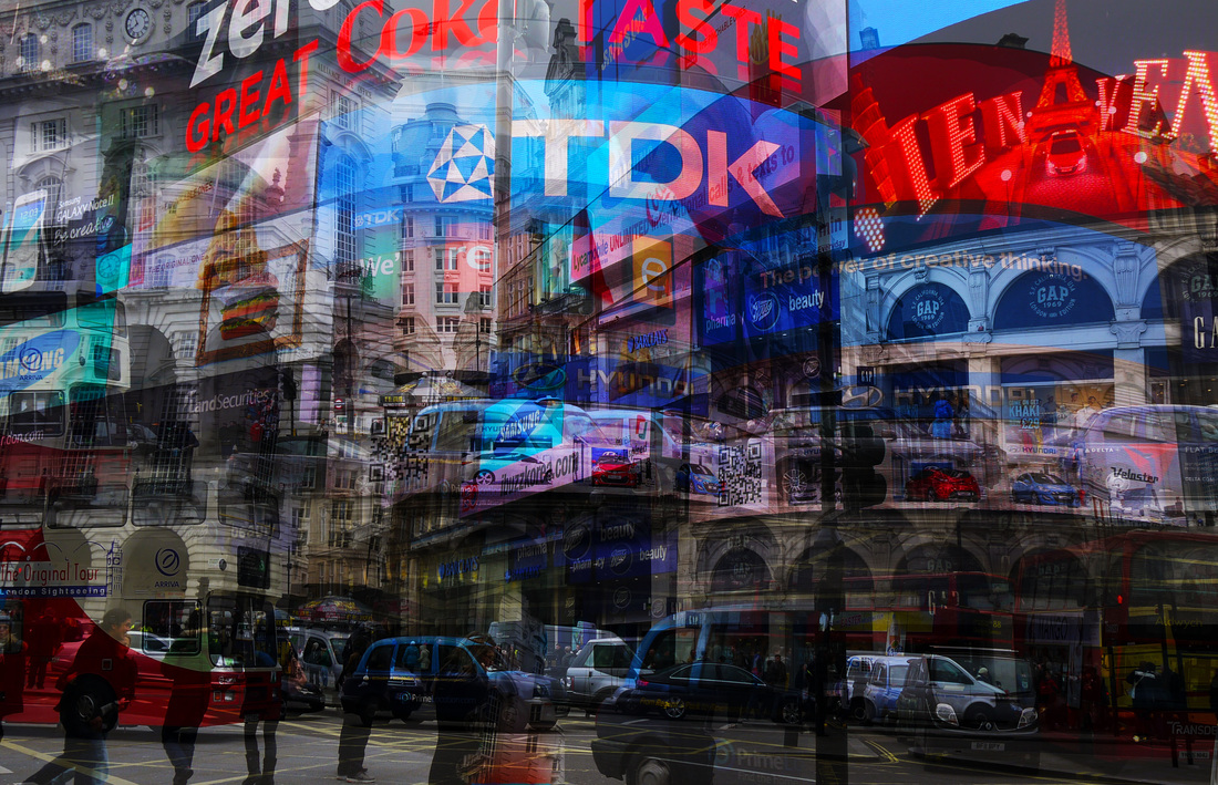
After looking at Laurent Dequick I wanted to create a city style picture and so I went to central London (Piccadilly Circus and Soho) to take photographs. I then created the four images below. I think they work best when the different layers are still solid and not too translucent, that is why the bottom left doesn't work. Although I think the contrasting colours in the images are effective as they make it more dynamic. I think they would work better if I took the same picture but from slightly different angles and then layered them, as it would create a more compact while maintaining detail. |
|
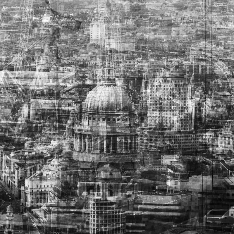
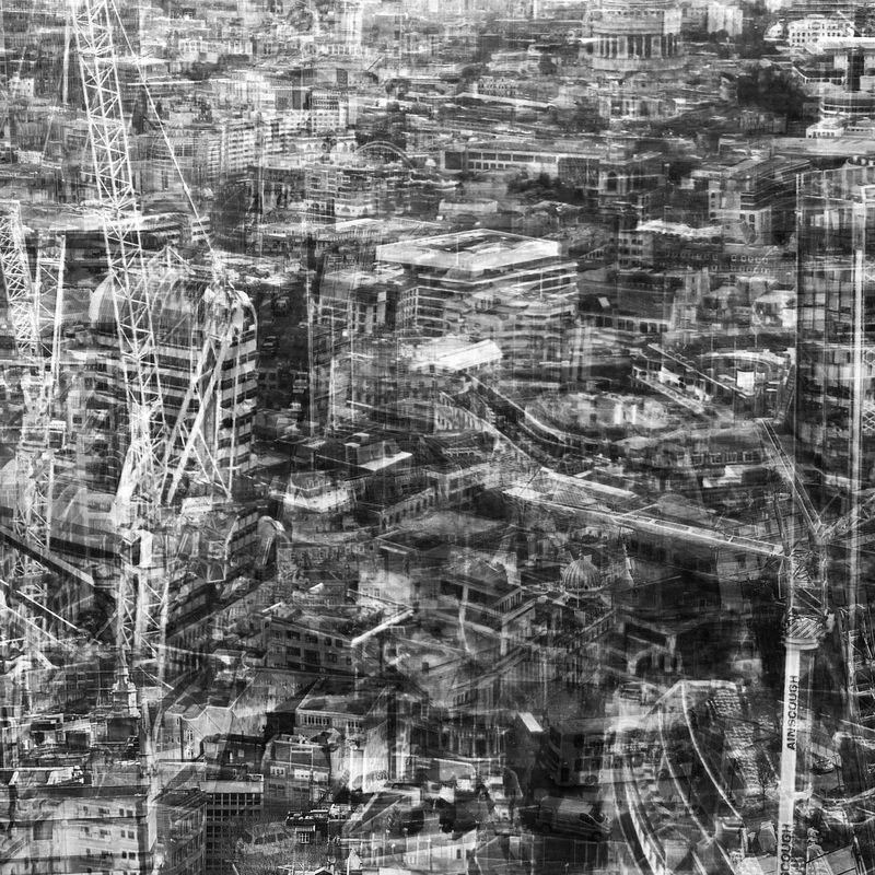
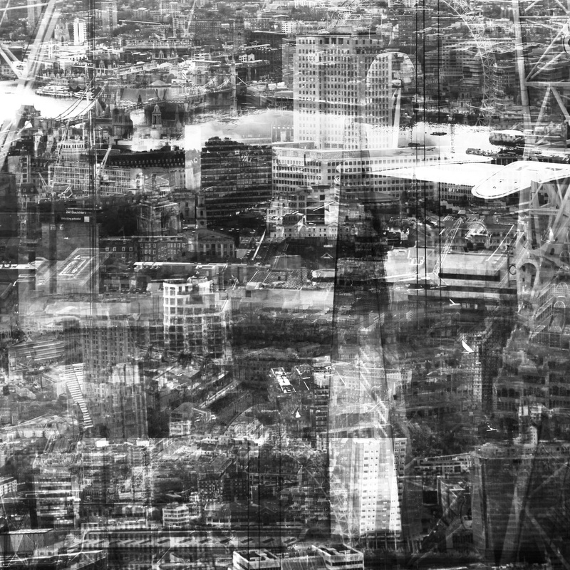
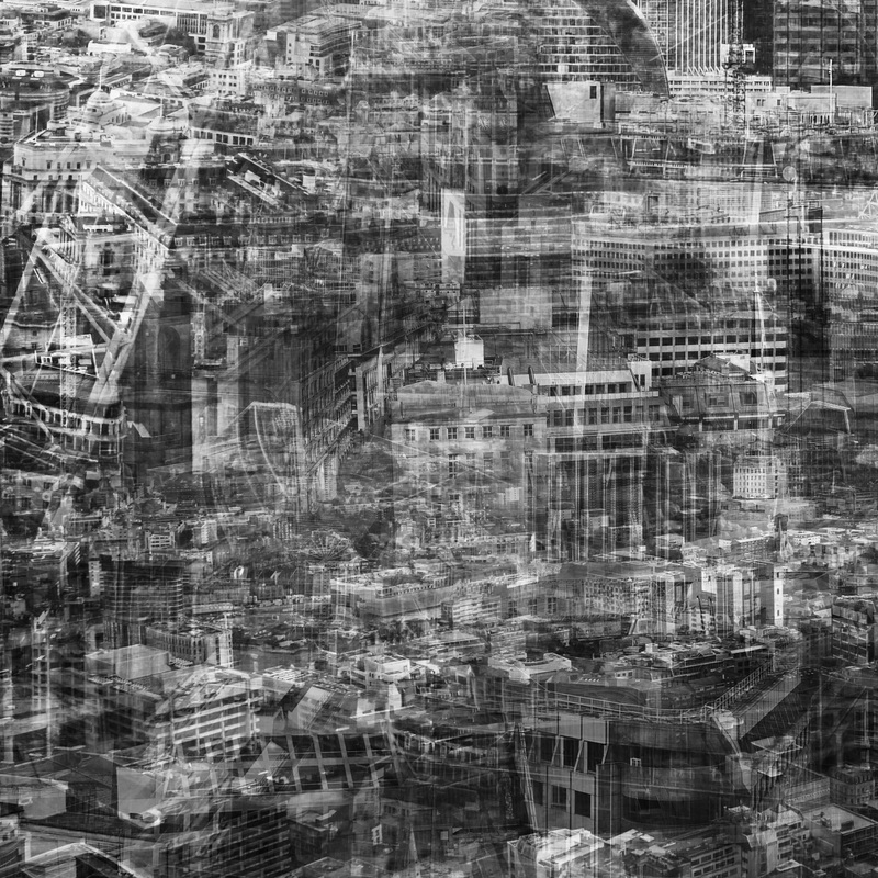
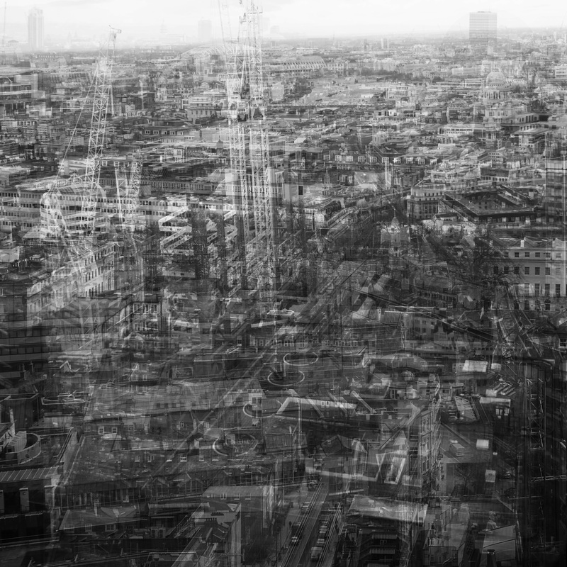
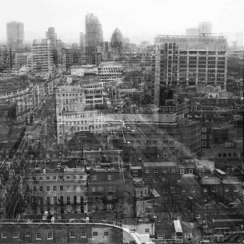
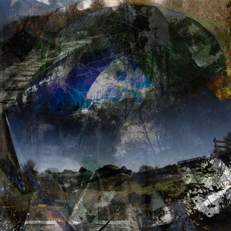
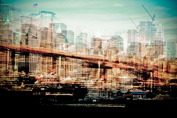
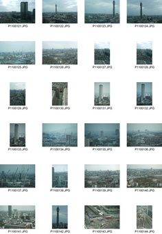
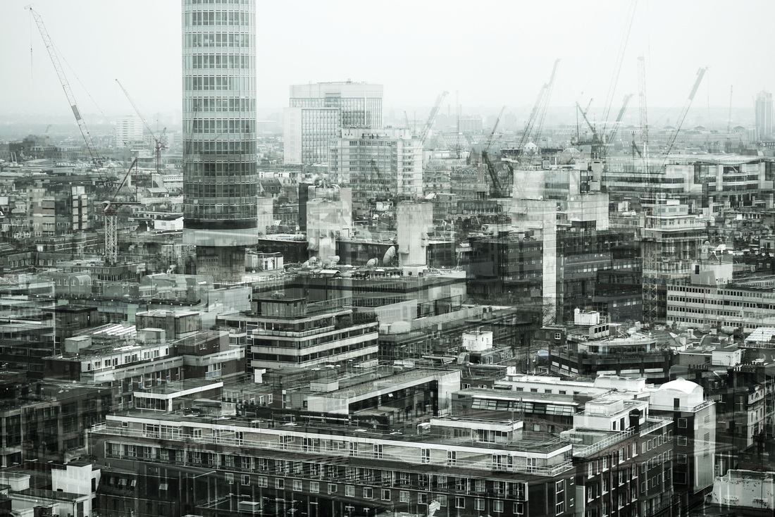
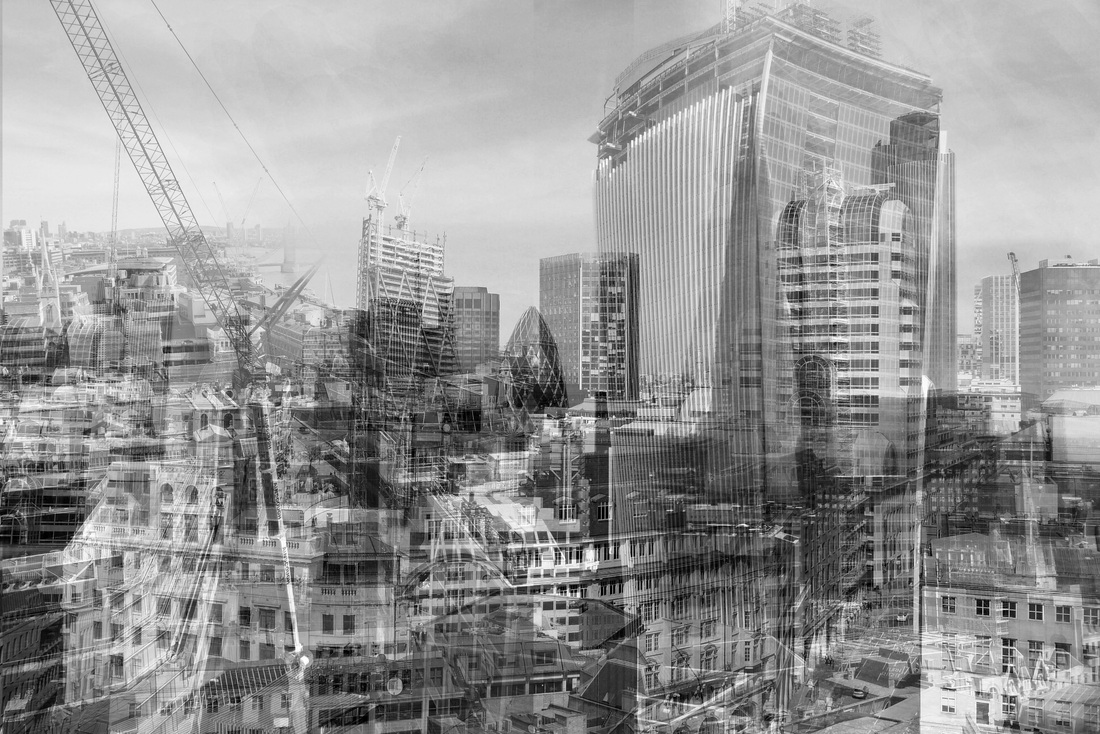
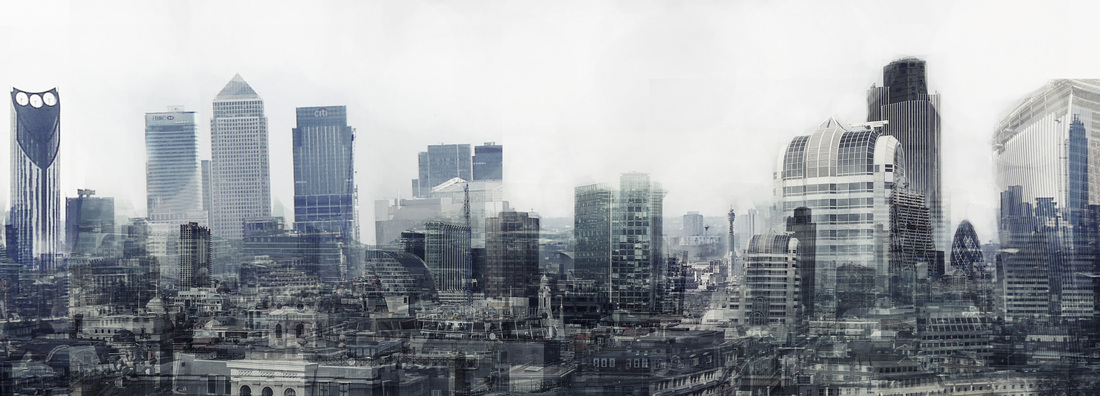
I also found a high vantage point where I could take pictures of the London landscape. I then created the images below by layering the various images. Unfortunately it was a cloudy day and this has hindered the pictures as they appear slightly grey and the distant buildings are unclear. Therefore if I am to develop this further I might go and take some pictures on a brighter day. However it is difficult to find high points in London where you can see the landmarks.
|
|
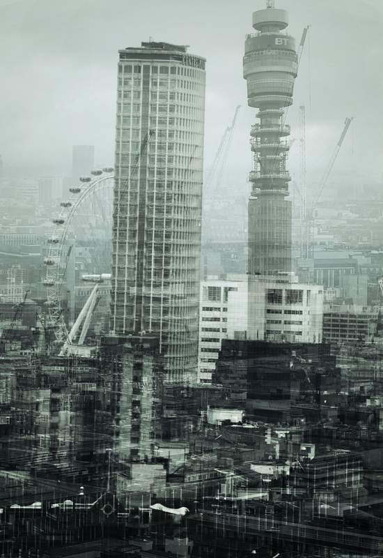
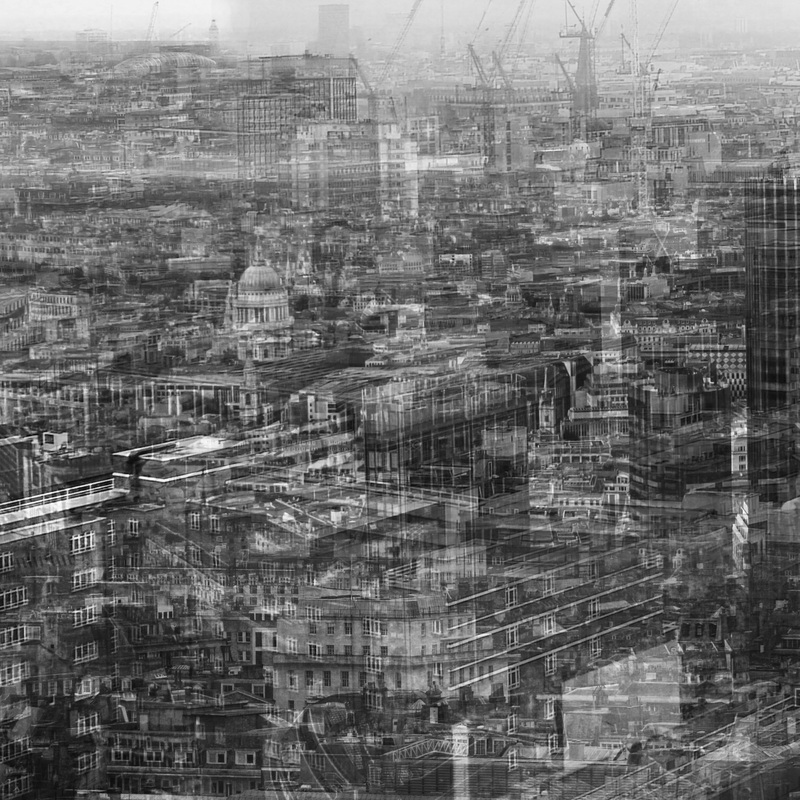
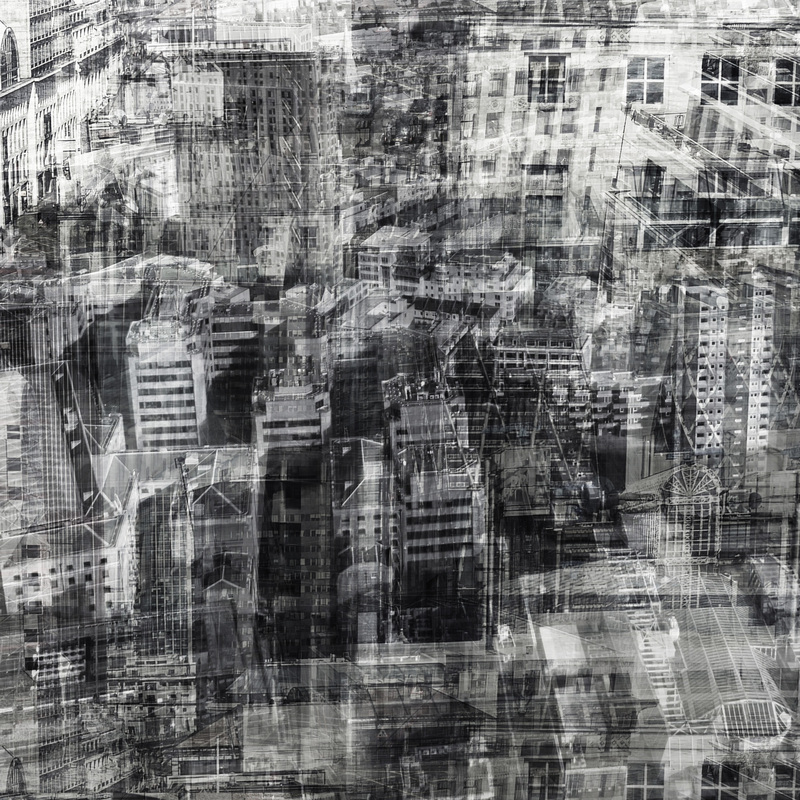
I thought that the two images above worked well, although it would be more interesting to create a wider, panoramic landscape and so I made the picture below:
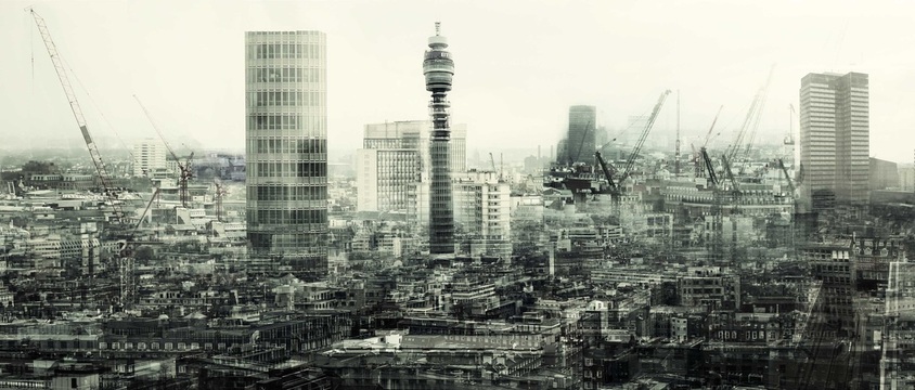
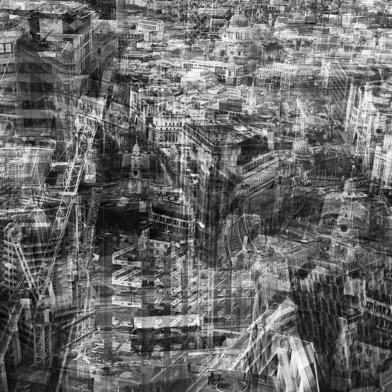
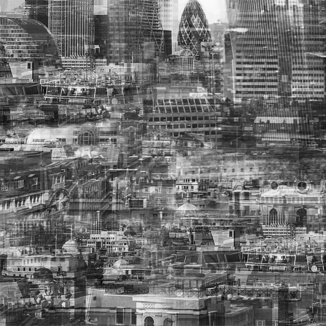
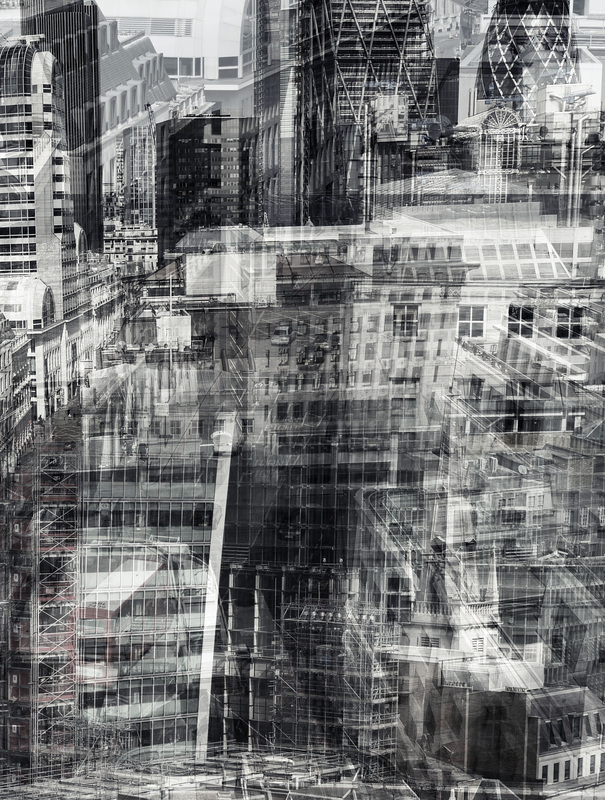
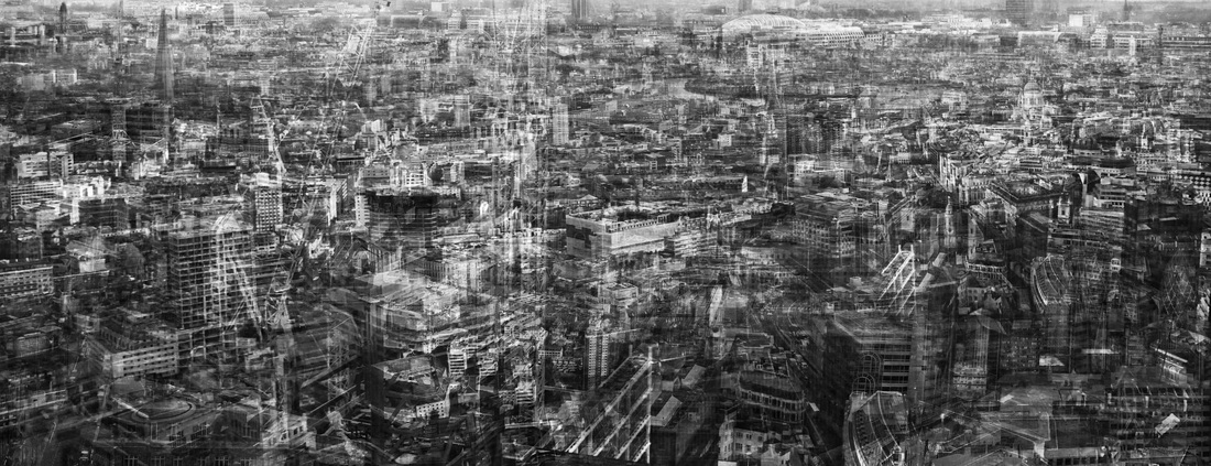
I think the foreground of the panorama works well as it is densely layered which shows how built up the urban landscape is. I think the composition could be improved, as the taller buildings don't compliment the photograph. To develop this idea I then created this image below using different photographs from another set of observations. This picture is the most successful as the high contrast creates a sketchy effect and there isn't a blank area (sky) which works better as it improves the composition.
|
I wanted to create some place specific collages/layer photos and so I visited Camden and took pictures of the local area: |
|
|
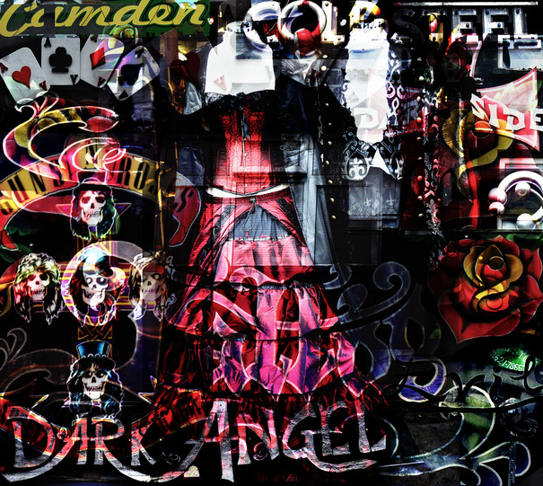
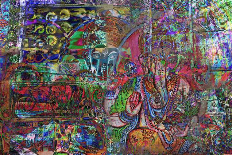
For this collage I used a gothic theme. I used two costumes for the central focal point and then layered various photographs around it. The vibrant colours stand out against the black which works well as it creates a bold image.The bottom half of the image works best, this is because the images have been layered with different opacity for each which has enabled the different images to merge together. I think the top left corner could be improved, as the green camden sign doesn't compliment the rest of the image as it has not been merged into the other layers.
The image below is effective due to its vibrant, contrasting colours. The small details in the image make it appear complex, although the image is not too busy, there is therefore a good balance of detail.
The image below is effective due to its vibrant, contrasting colours. The small details in the image make it appear complex, although the image is not too busy, there is therefore a good balance of detail.
|
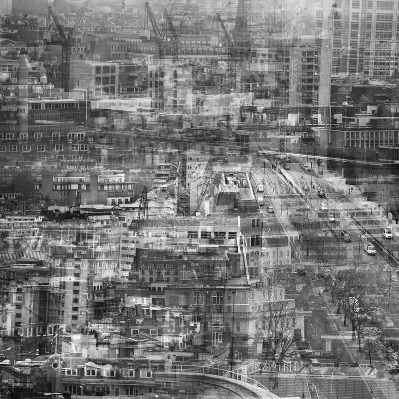
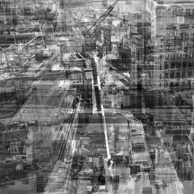
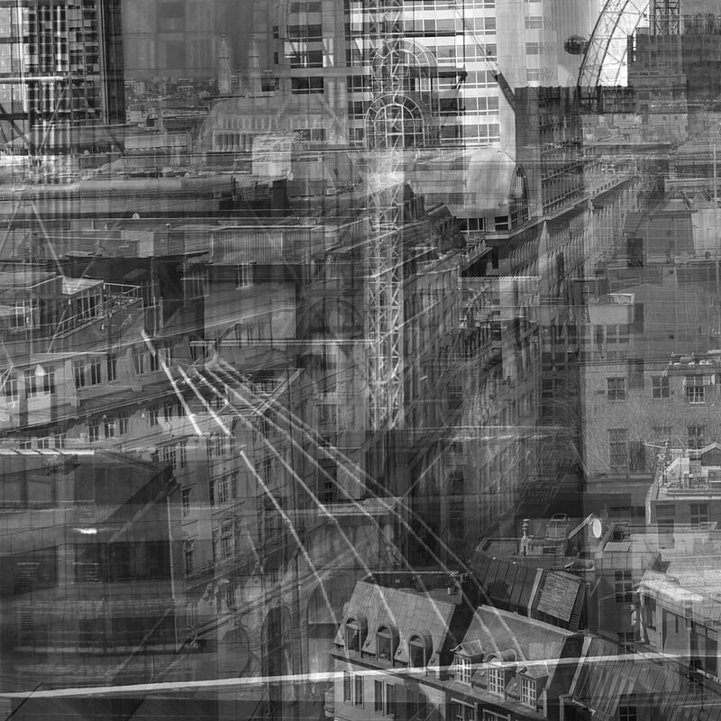
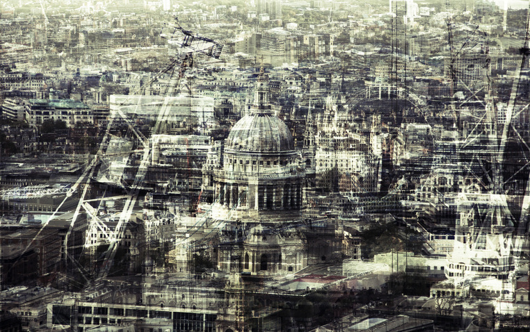
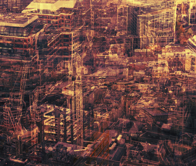
I wanted to get some more landscapes of London and so I went to Monument and took some photos. I then layered them in photoshop and produced the images below. I think the image on the right works well as the different layered textures of glass create a sketchy effect. Although I think overall the panorama is the best, as it creates a sense of scale and presents a metropolis. I think the foreground works well as it is dense, however some of the background buildings are too translucent which takes away the solid appearance of the buildings. |
|
|
When experimenting with layering landscapes I used various gradient maps to create different coloured effects. Originally when adding the gradient map the image was too saturated and so I lowered the opacity of the gradient map layer. I think the colouring works well, however there are limited gradient maps which compliment the image. |
Final Piece
For my final exam piece I created a layered panorama of a city landscape:
I also made 15 small layered landscapes which I will put into three photo cubes: